Amplio's Dashboard
SaaS Application
Introduction
Amplio is a special education learning platform that combines a learning management system with built-in programs & dyslexia curricula for educators, students and administrators.
My Responsibilities
- UX Design
- Visual Design
Background
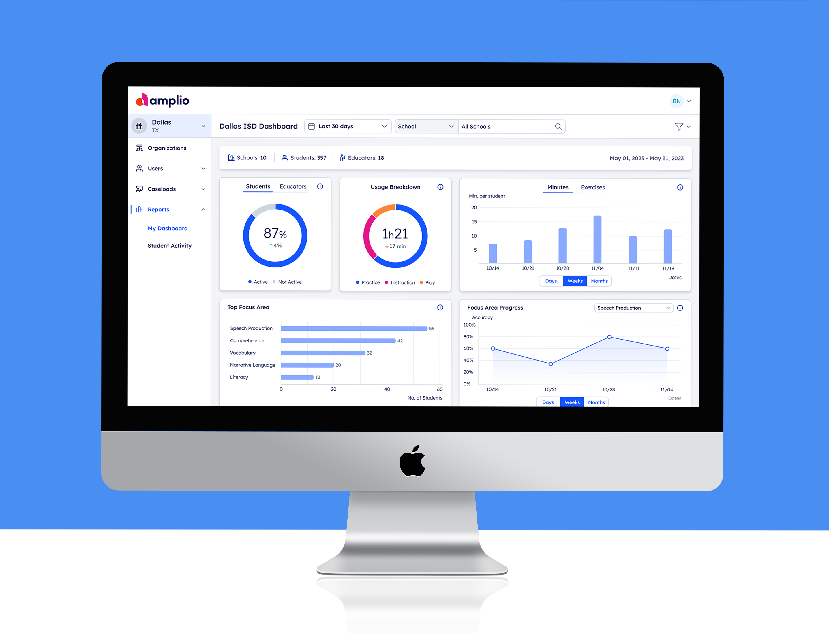
The UX design of the dashboard came from the need to gather all achievements of students and educators, and provide the administrator a quick glimpse into the current statuses.
A commitment was signed between the educators and the parents at the beginning of the year; therefore, it was important that the data collected on the platform be correct and reliable.
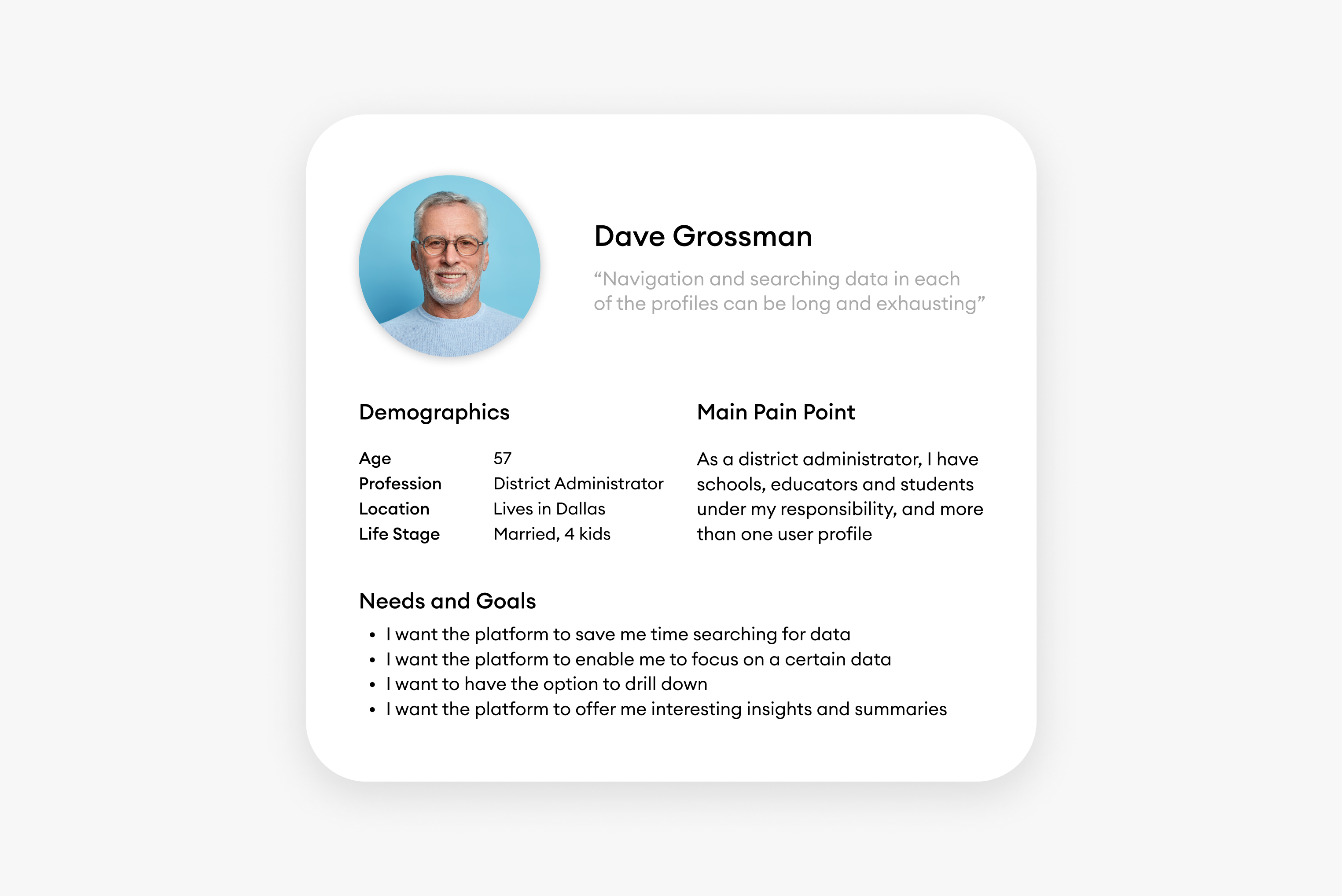
Also, since the platform is complex, the administrator needs to find specific data quickly and efficiently.
Challenges
We wanted to create a more focused platform per persona, so we decided to add filters to the platform 🎉
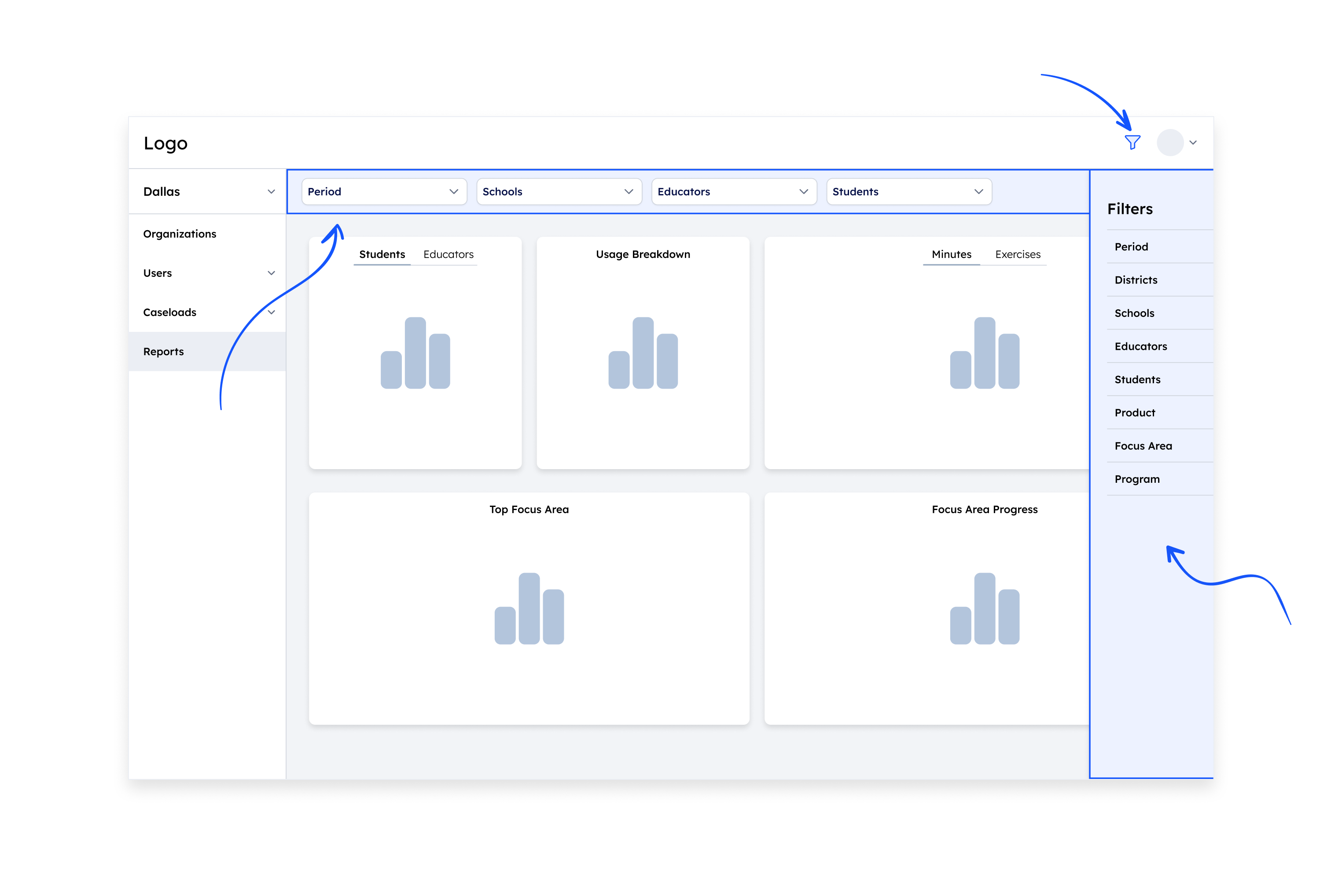
1. We had to decide what position on the page, and make sure that they are not hidden, but also do not take up real estate and move the data.
2. The basic assumption was that the filters should be in the same hierarchical structure that schools are built, that is: schools > educators > teachers. However, when we started creating sketches we realized that this structure does not always serve our persona or filter the data enough.
Additional Challenges
After we decided to place the filters as secondary and permanent headers, other challenges arose.
Filters Vs. Navigation
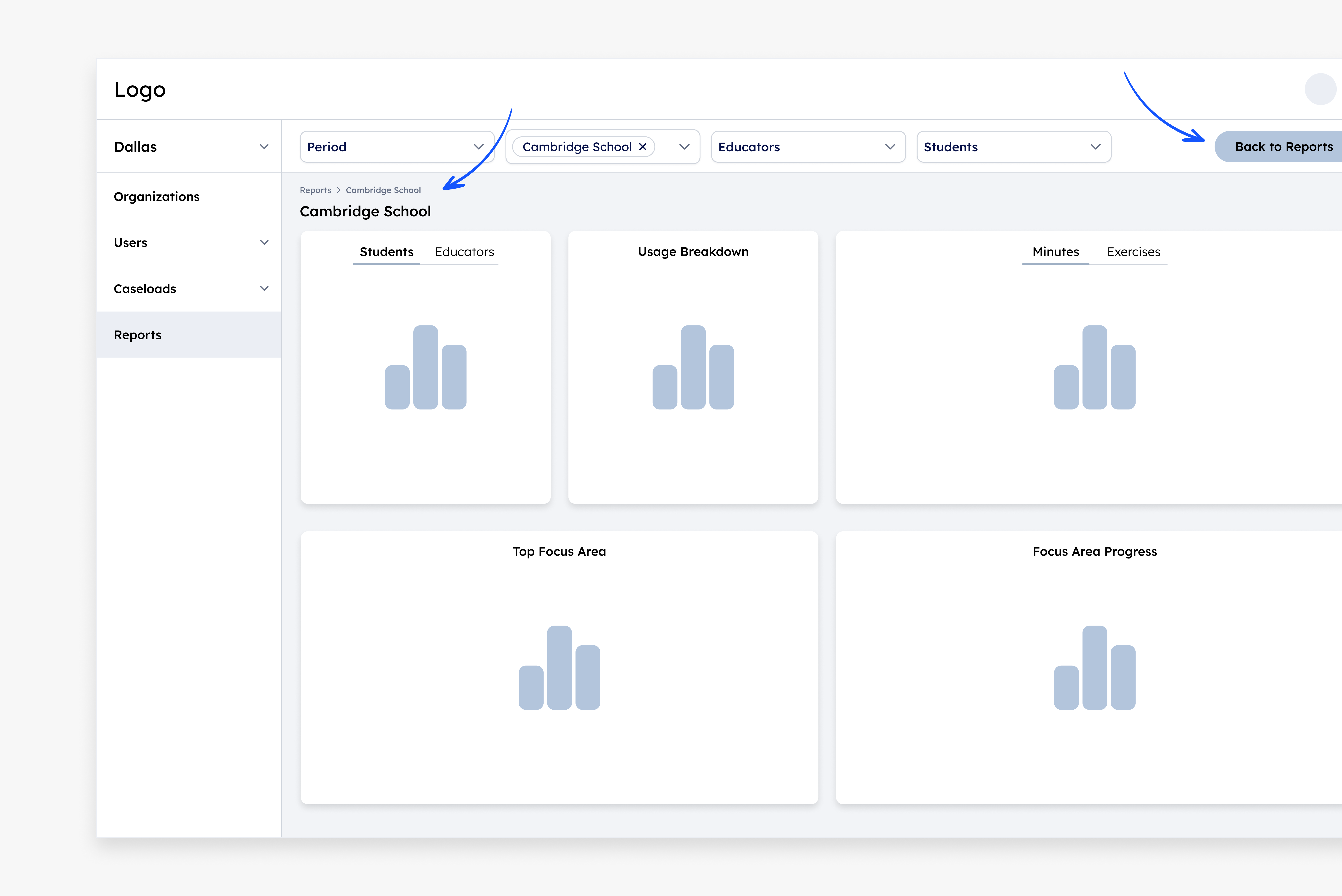
The filter enabled the users to reach specific data, but it created complications in navigating back and forth. Also, the pages looked too similar, creating orientation confusion among users.
In addition, there was a lack of a summary display for each educational institution (number of students, number of educators, etc.).
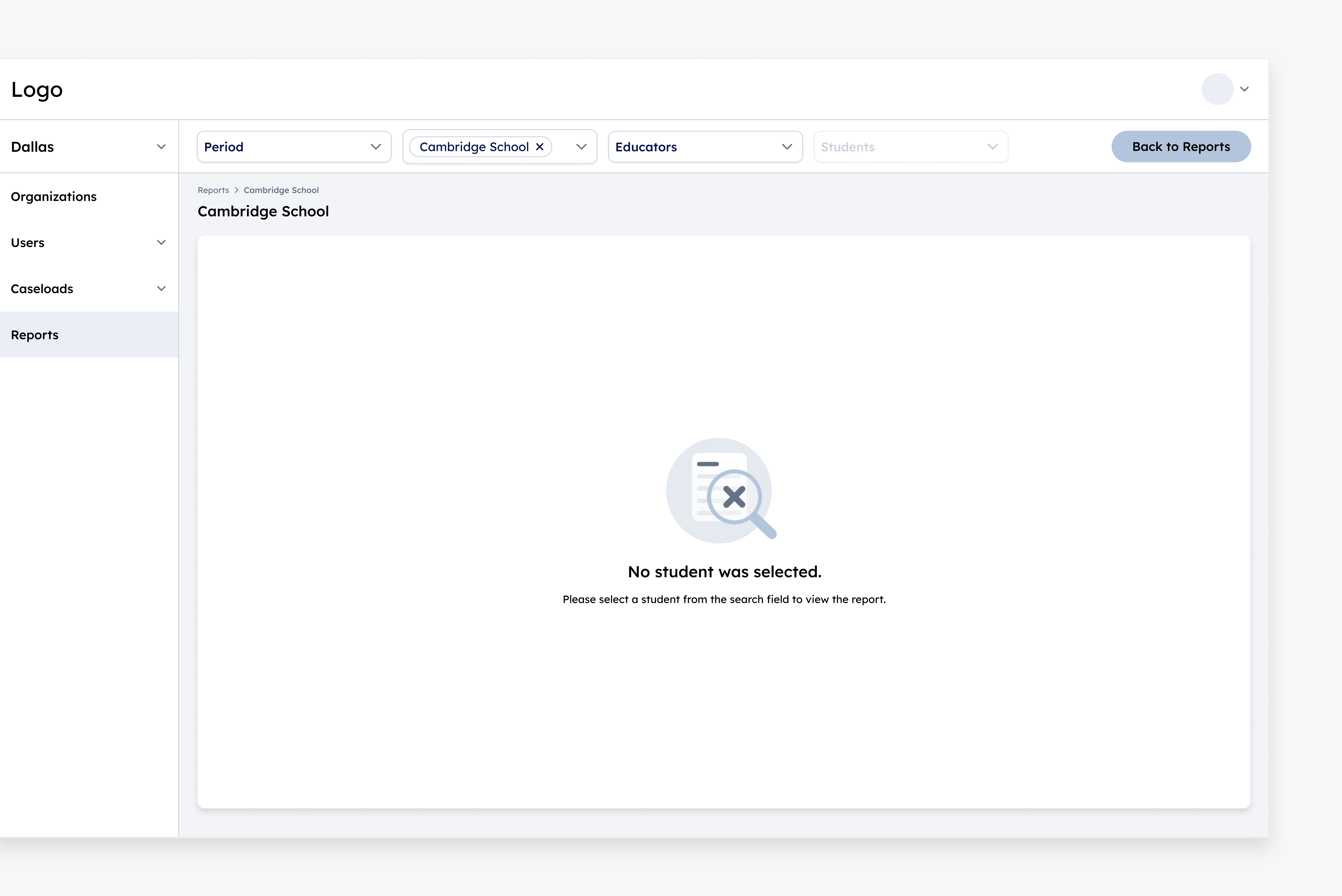
No Results
Since all the entities on the platform belong directly to the district, the linear-hierarchical filter did not produce optimal results: either there were no results at all or there were too many results, and the filtering did not enable users to reach an in-depth and insightful comparison.
As a result, the users looked for the affiliation of that student/educator in other tabs, and only then returned to the dashboard to compare.
This path was long and tedious, and caused a lot of frustration.
Where do we go from here?
At this point we reached a dead-end. It was necessary to stop for a moment, think about the problem again, and find creative solutions.

Turning Point 💡
Following a brainstorming session between design and product, and additional conversations with users, we understood 2 main key points that enabled us to reach the final solution.
New Navigation
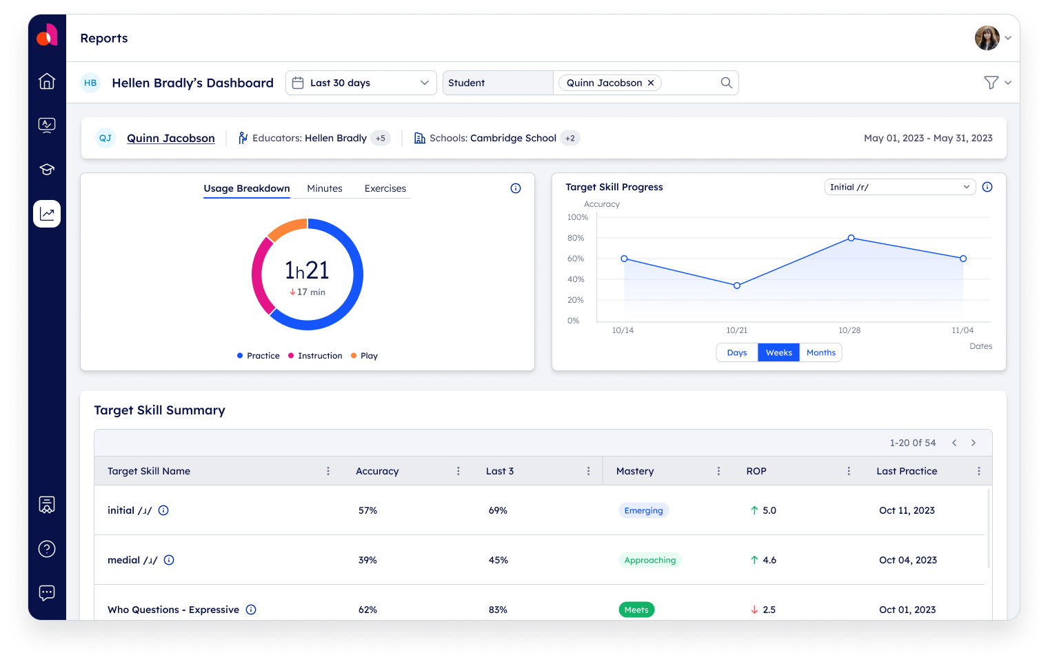
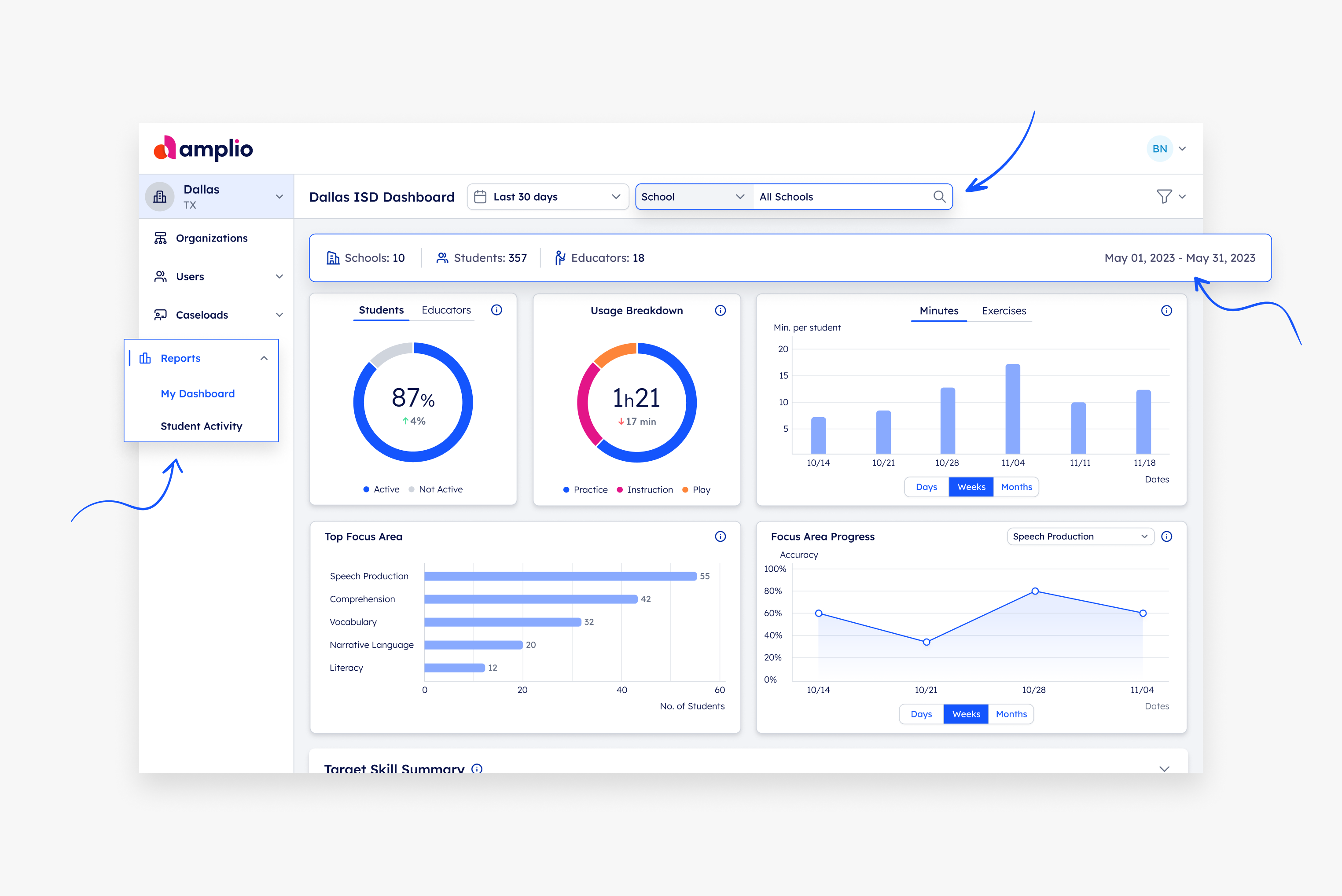
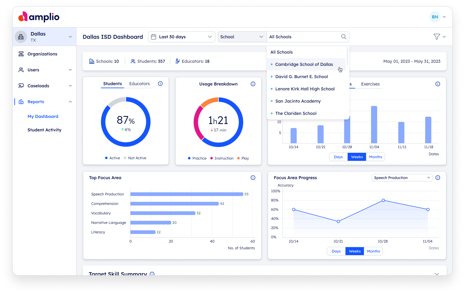
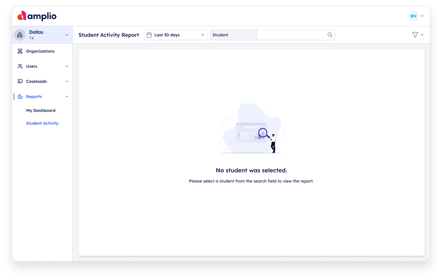
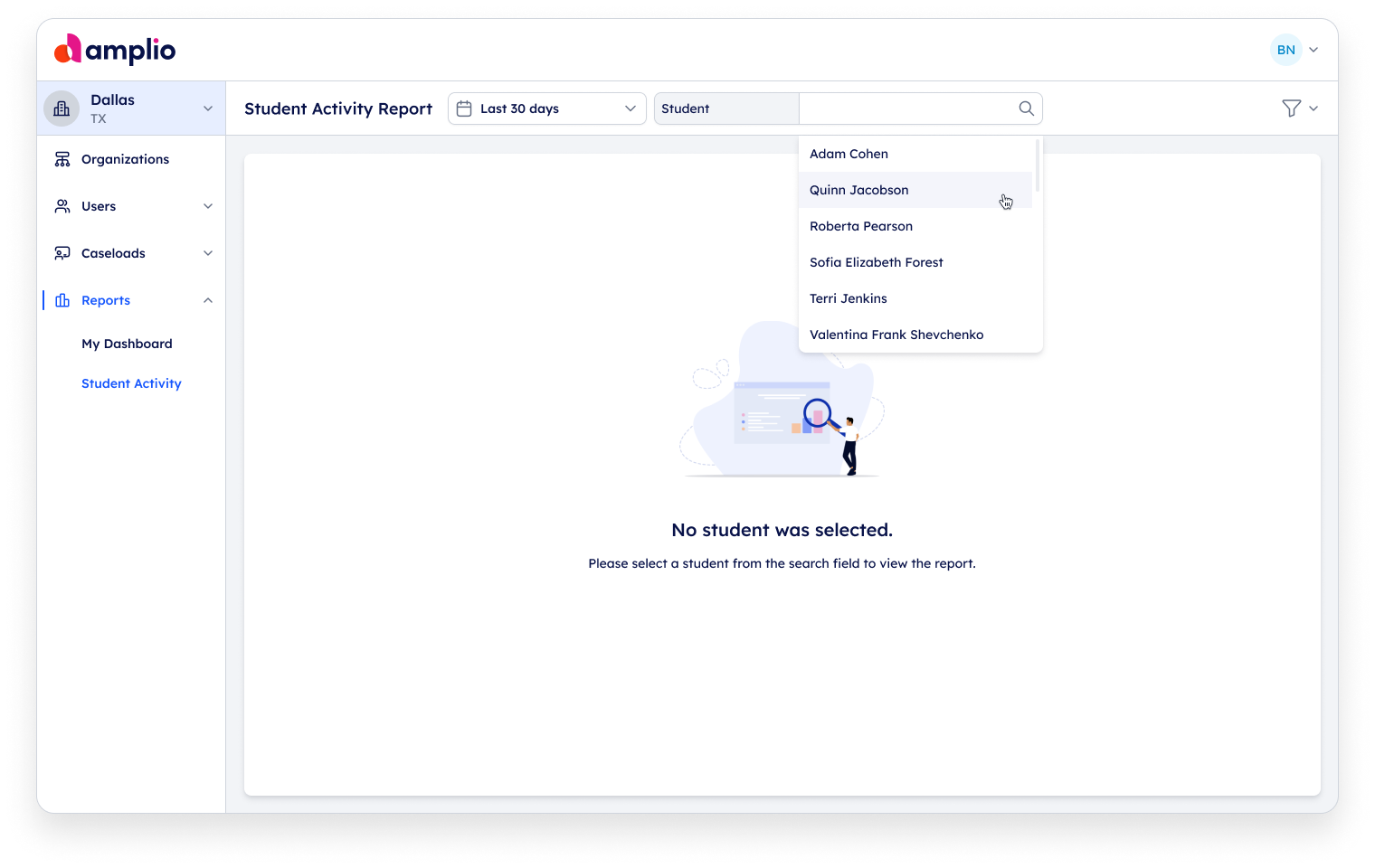
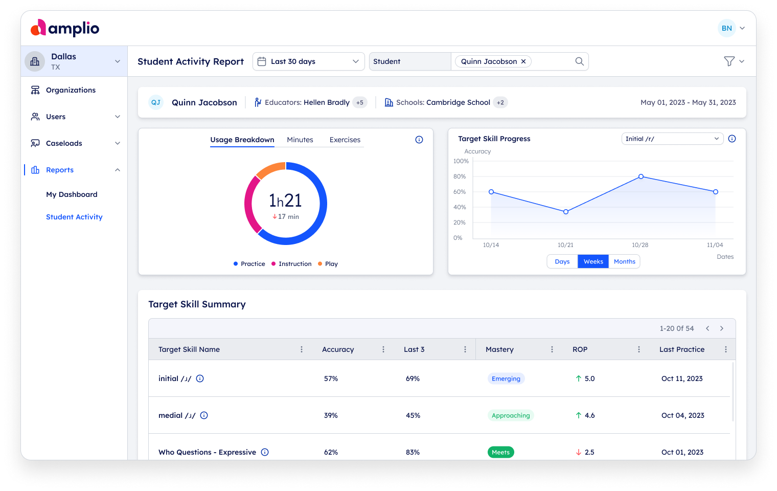
We created two new pages within the "Reports" tab, and thus separated the navigation between ״Aggregated Dashboard״ and ״Student Activity״.
Later, we adjusted the data segmentation in the educator's dashboard as well.
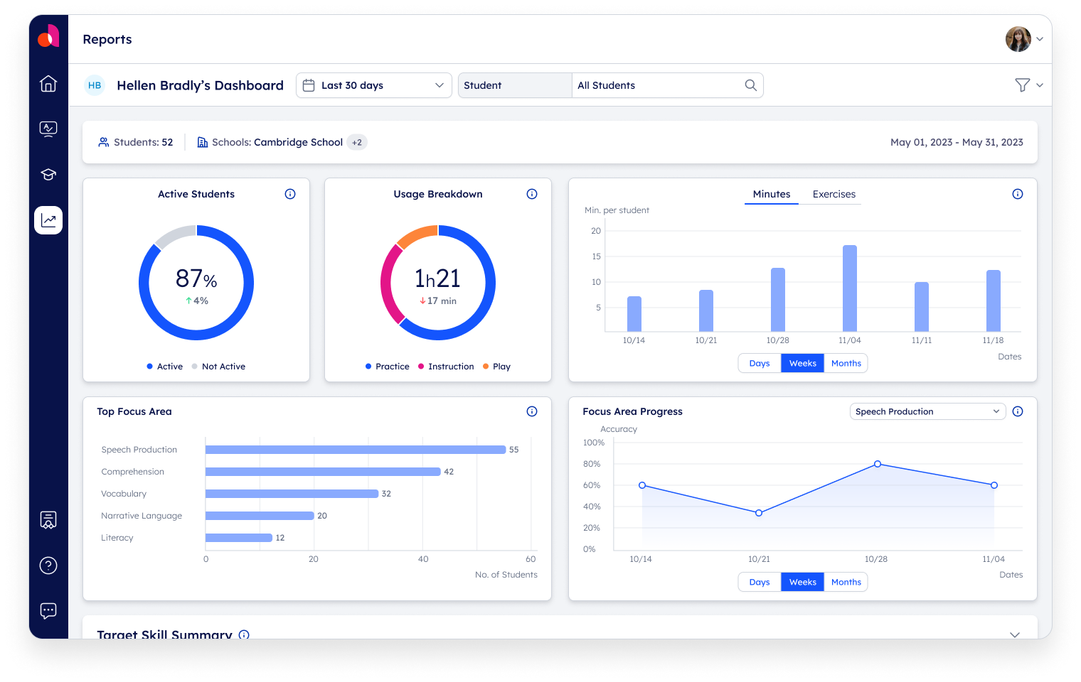
Additionally, we created a summary card that displays the name of the academic institution, the number of students and educators and the requested period. Now the users have a clear indication of their location on the platform, eliminating their previous confusion.
New Hierarchy
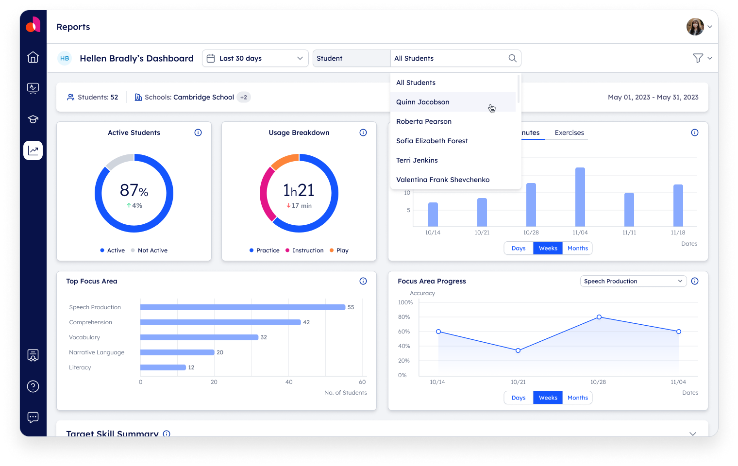
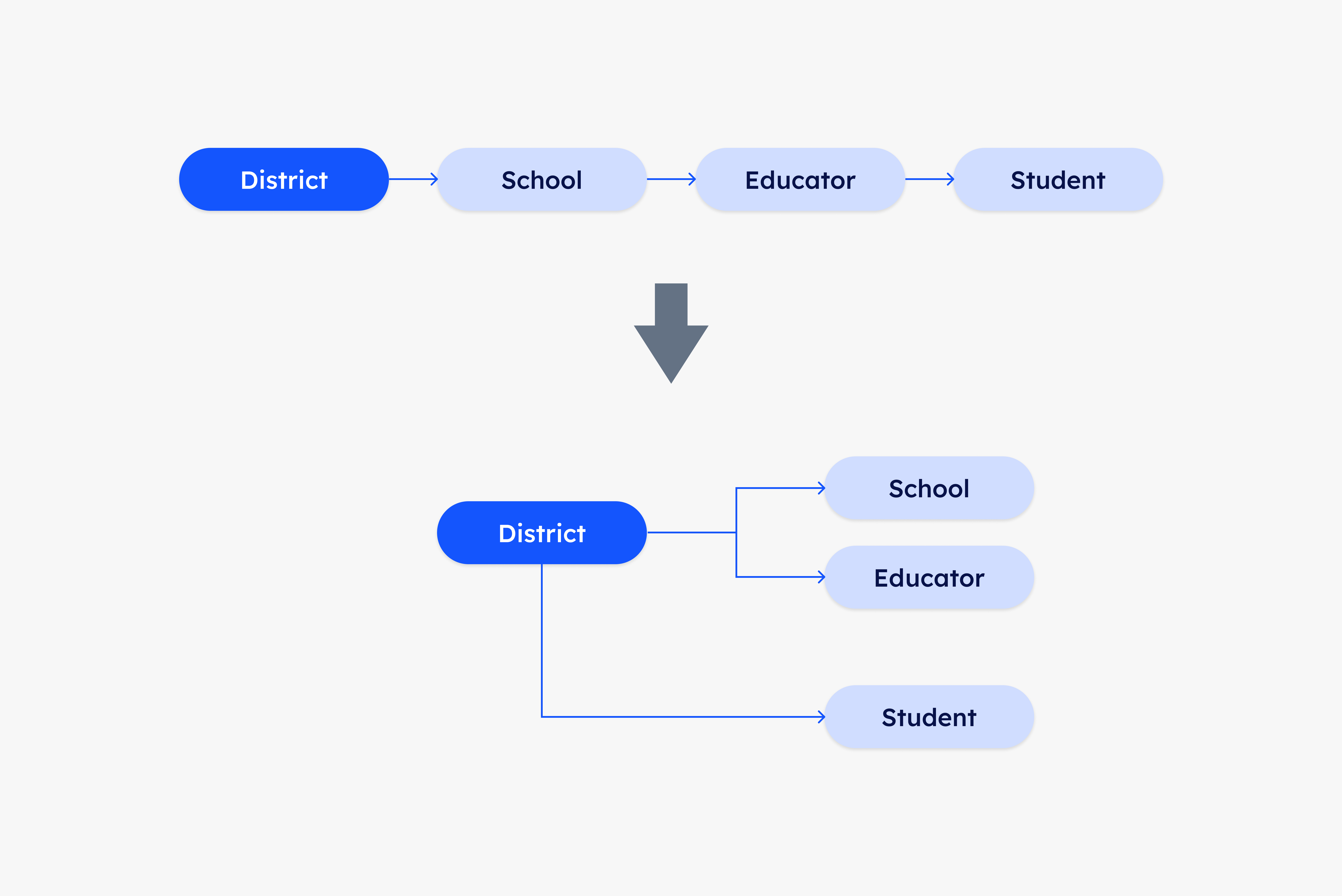
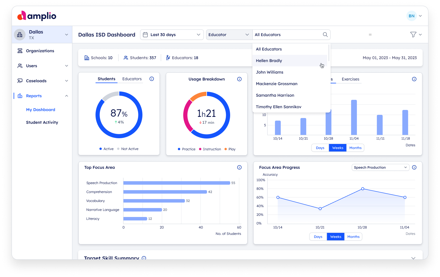
We separated the linear filter, and created a new hierarchy. Under the district administrator's dashboard you can search for a student only, or choose between a school or educator search.
This conclusion affected both the structure of the pages and the structure of the search component.
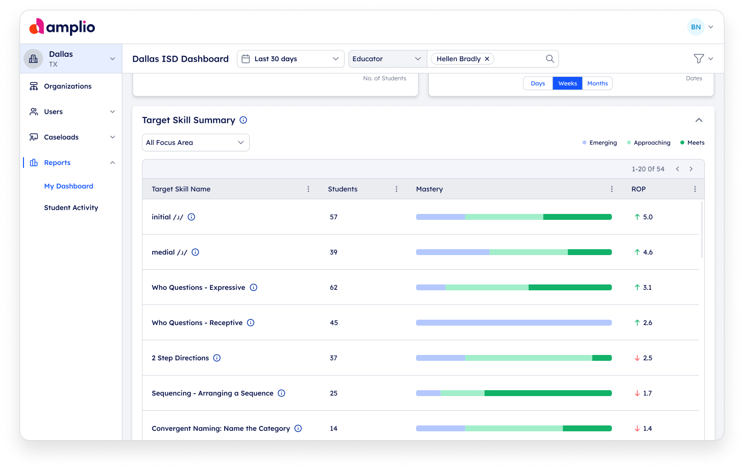
In this way, users can quickly compare the data and drill down according to each segment all in one page.
Resolution
District Dashboard
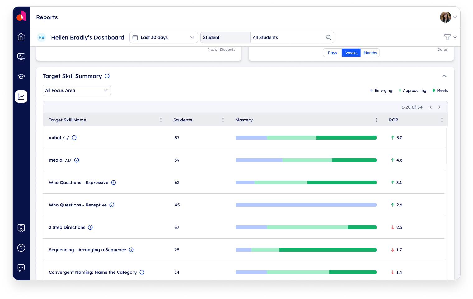
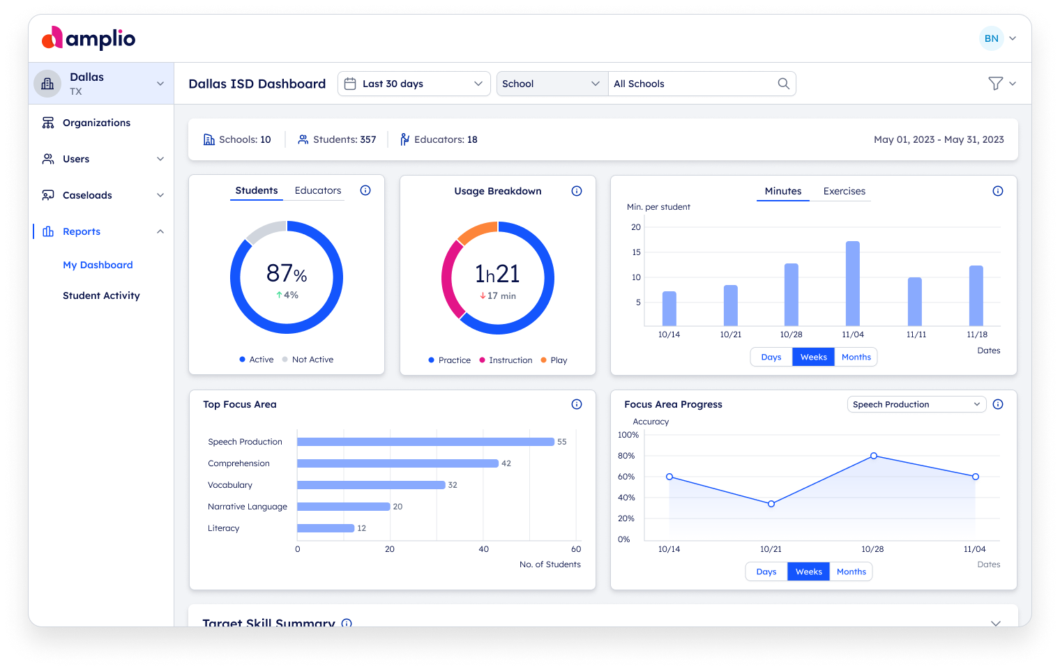
In the new design, users can navigate between the entities (student, educator, school) conveniently and efficiently, receive a summary display, and compare data with ease.


Educator Dashboard
Once the solution for the more complex dashboard was found, it was straightforward to implement the solution in the educator's dashboard. Here the emphasis was on segmenting the data for students only, and measuring improvement over time.
