Color Match
VR & Tablet Application
Introduction
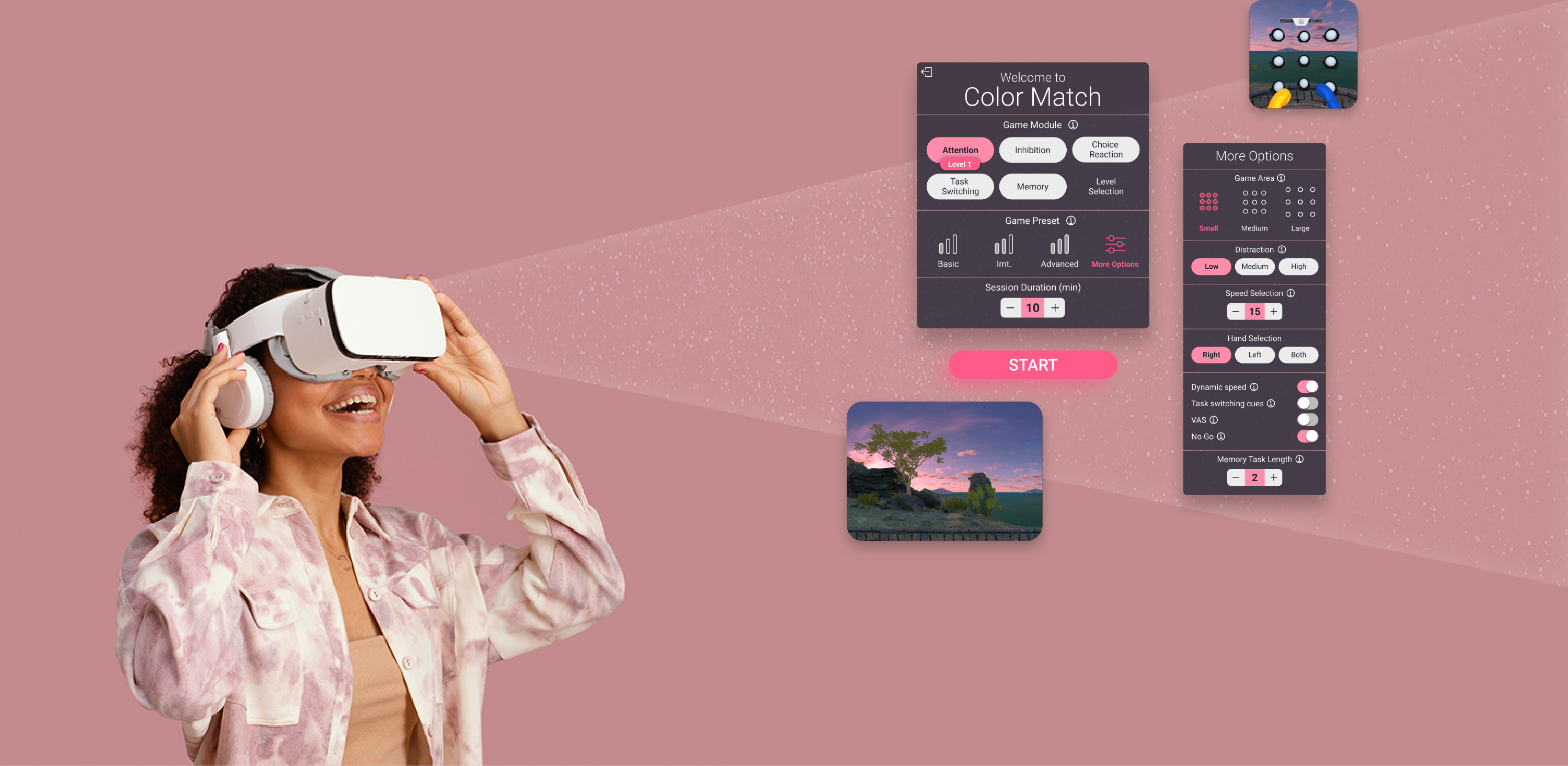
Color Match is a cognitive VR app that enables accurate measurements of processing speed, attention, and decision-making processes while training the upper extremities.
My Responsibilities
- Research
- UX Design
- Visual Design
Research
Objectives
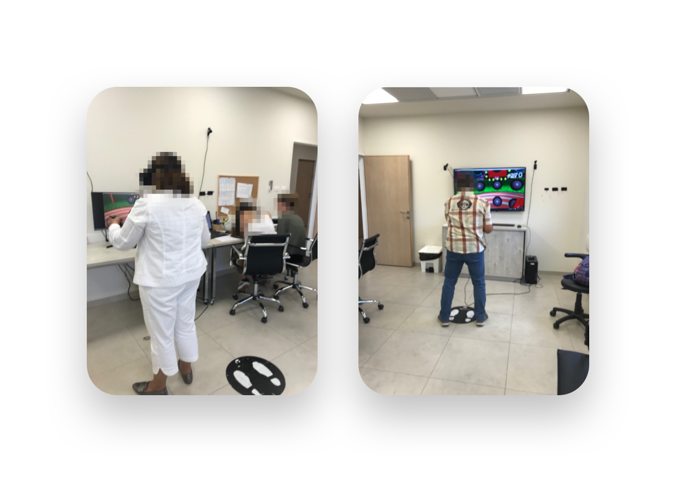
First, an important part of my job was to get to know the users of our VR app; therefore, I observed and conducted interviews at Assaf Harofeh Hospital.
My goals were:
- Receive feedback from patients, station operators, and doctors about the VR experience
- Validate our assumptions regarding the new and future modules of the app
- Improve data collection and data analytics
Personas
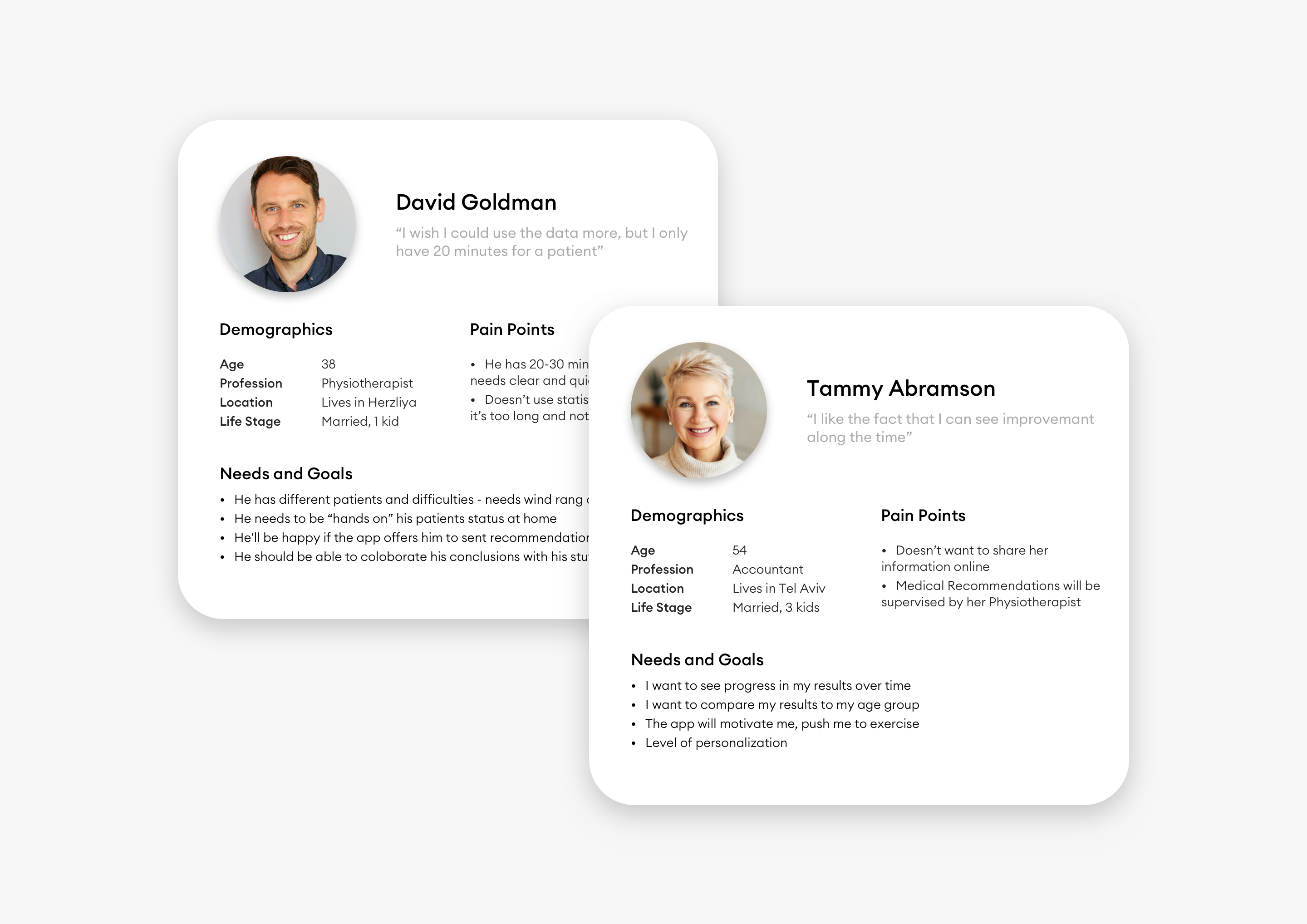
Based on the preliminary research, I created two personas which I referred to throughout the entire product design process:
- Patient - age group 35-75 yrs
Inner motivation: preservation of their cognitive state - Therapist - age group 45-65 yrs
Inner motivation: dedication and concern for their patients
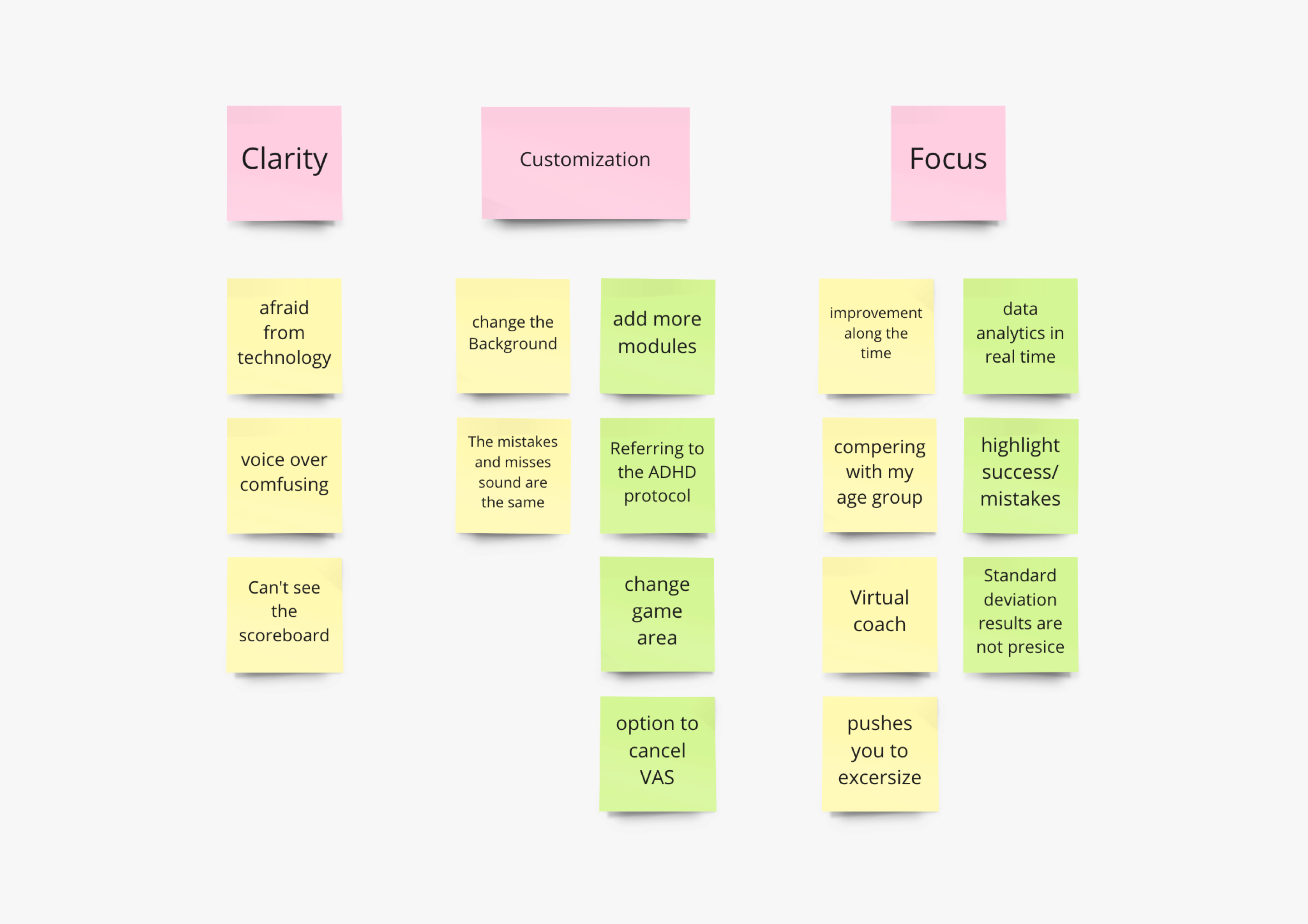
Key Insights
Clarity
The experience in the VR world can be very overwhelming (especially for users over 65) and therefore the UI should be simple, clear, and with a minimum of choices.
Customization
The clinicians presented us with the need to customize every session per individual patient.
Focus
It was extremely important for the patients to see improvements in their results over time. This has led to increased motivation and reuse of the product.
UX Design
User Flow
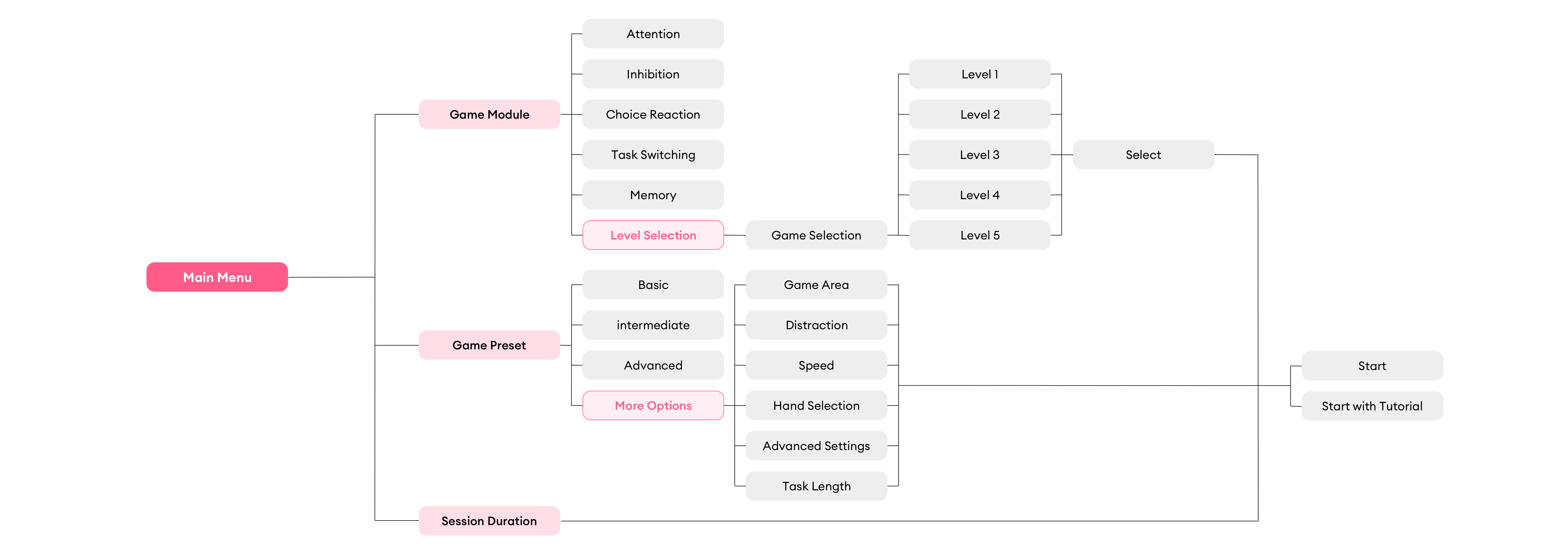
Based on the insights gained from the research, I defined the information architecture of the app.
This step helps me to validate my solution before jumping to visual wireframes.
Wireframes
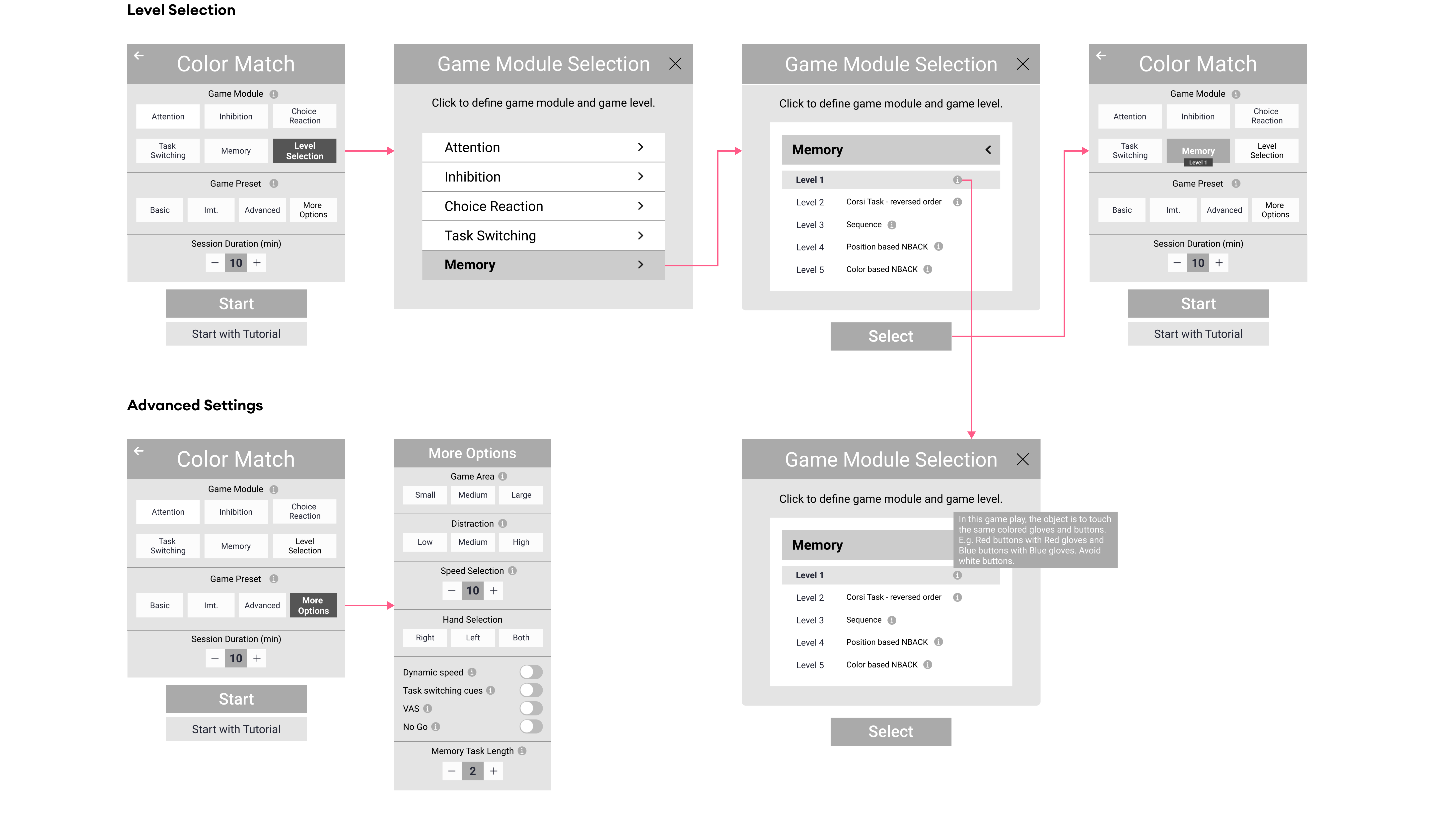
I started the design process with low-fidelity wireframes.
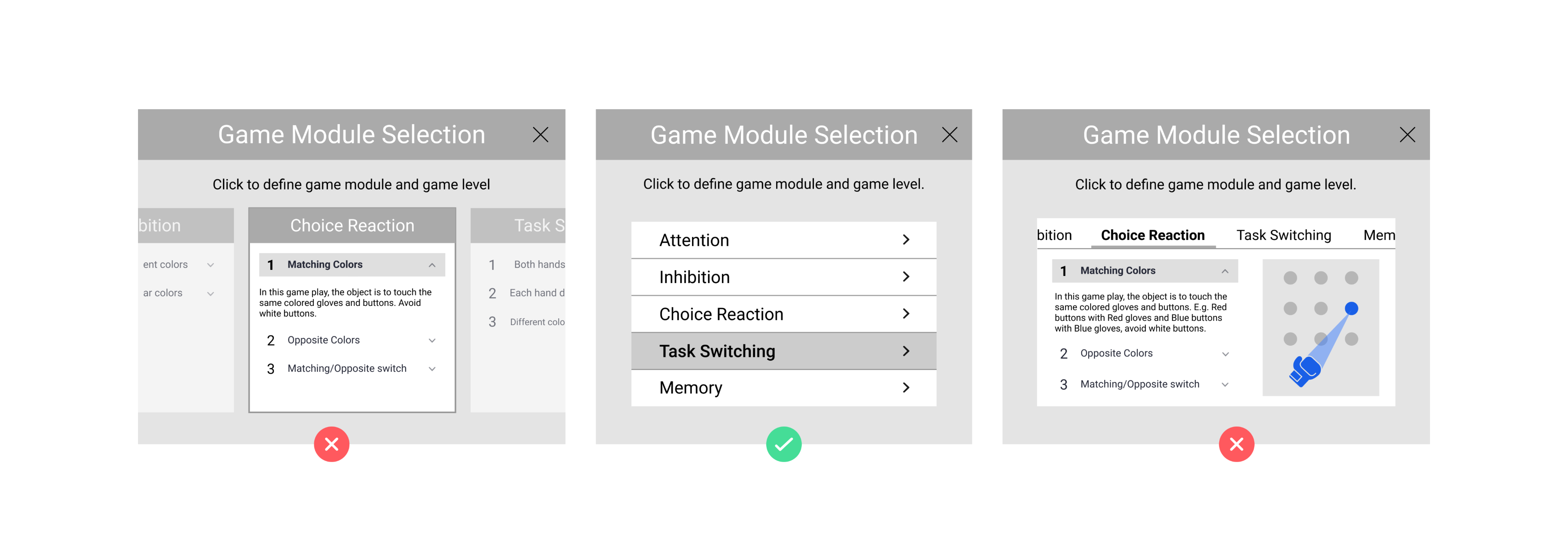
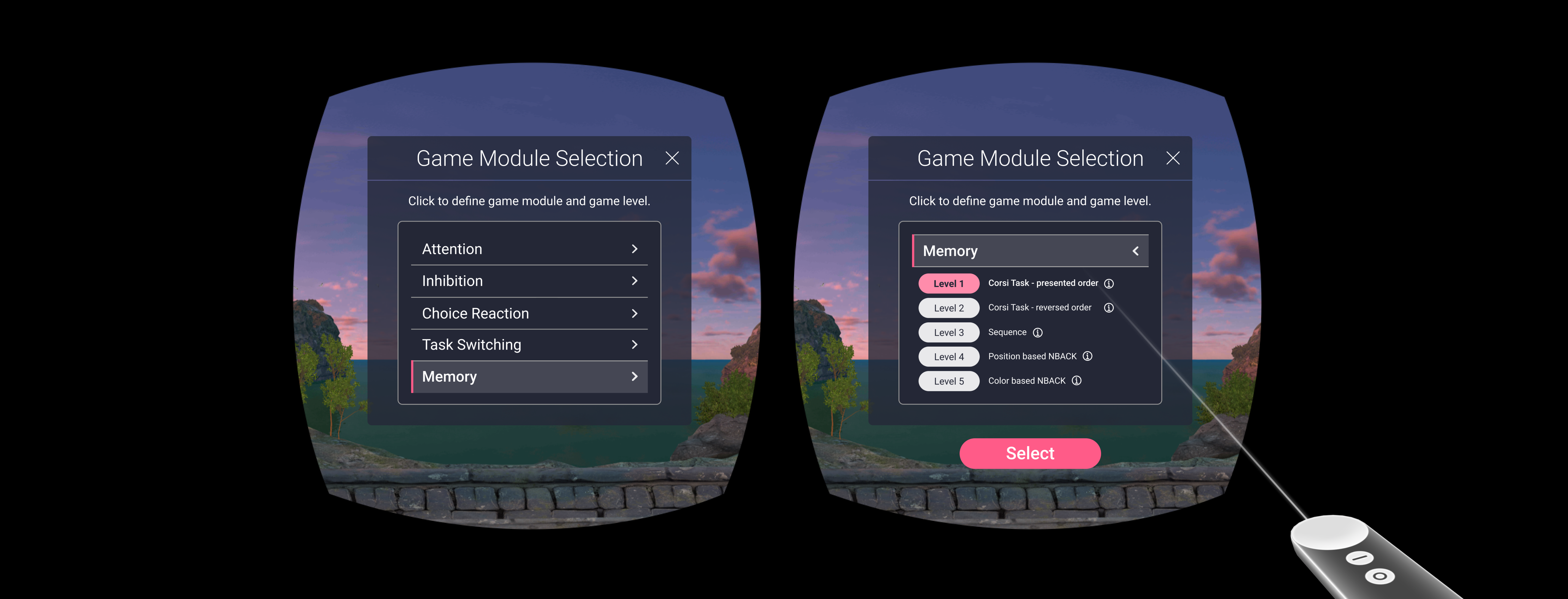
In my work, I chose to focus on solving the flow of level selection for each game and adding the level indicator in the main menu. A number of options were examined as a solution, and due to development time, VR viewing limitations, and concept simplification, the middle option (as indicated below) was chosen:
UX Solutions
This product has two types of personas so it was important for us to create a modular solution:
- A simple and intuitive basic menu for the end-users (the patients)
- An extended and "hidden" menu for the clinicians, enabling a wider range of adjustments
Level Selection - We created a popup menu with an option to drill down to choose the module and level.
After selection, an indicator appears on the main screen. This provided an effortless interaction for our customers with minimal development time.
Visual Design
UI Guidelines
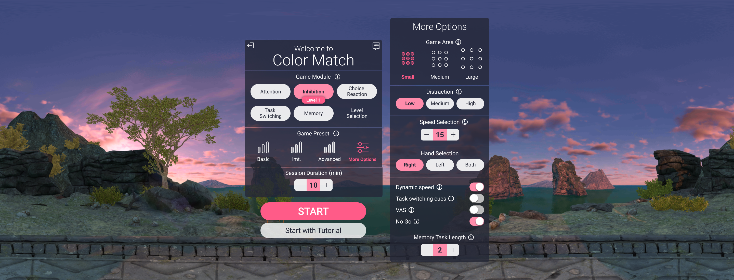
The final step was to design the user interfaces.
These were the main guidelines I set:
- Design the interface with a dark theme, taking into account lighting conditions in the VR environment, and light opacity so that the UI blends in with the VR environment around the user.
- Light and regular typography (minimum 20pt) due to VR viewing restraints.
- Icon buttons to create differentiation between the settings' sections.
VR Environment
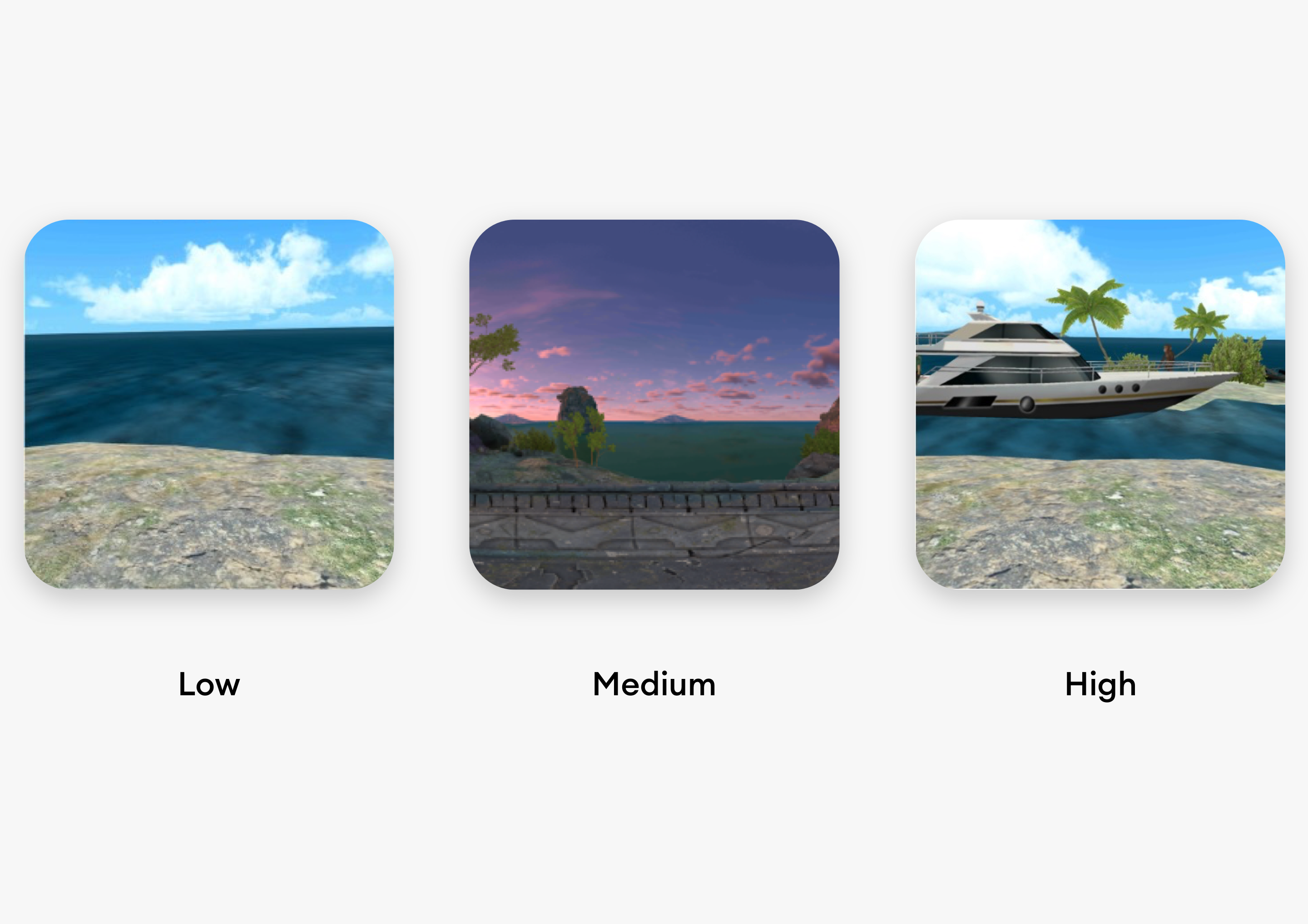
One of the insights that arose from the interviews was the desire to choose an environment - with or without in-game interruptions.
Later on, and in accordance with the company's strategic plan to add an ADHD treatment protocol, we created 3 different environments:
Low - no environmental distractions
- Medium - peripheral visual and auditory distractions
- High - central dynamic distractions
Data Analytics
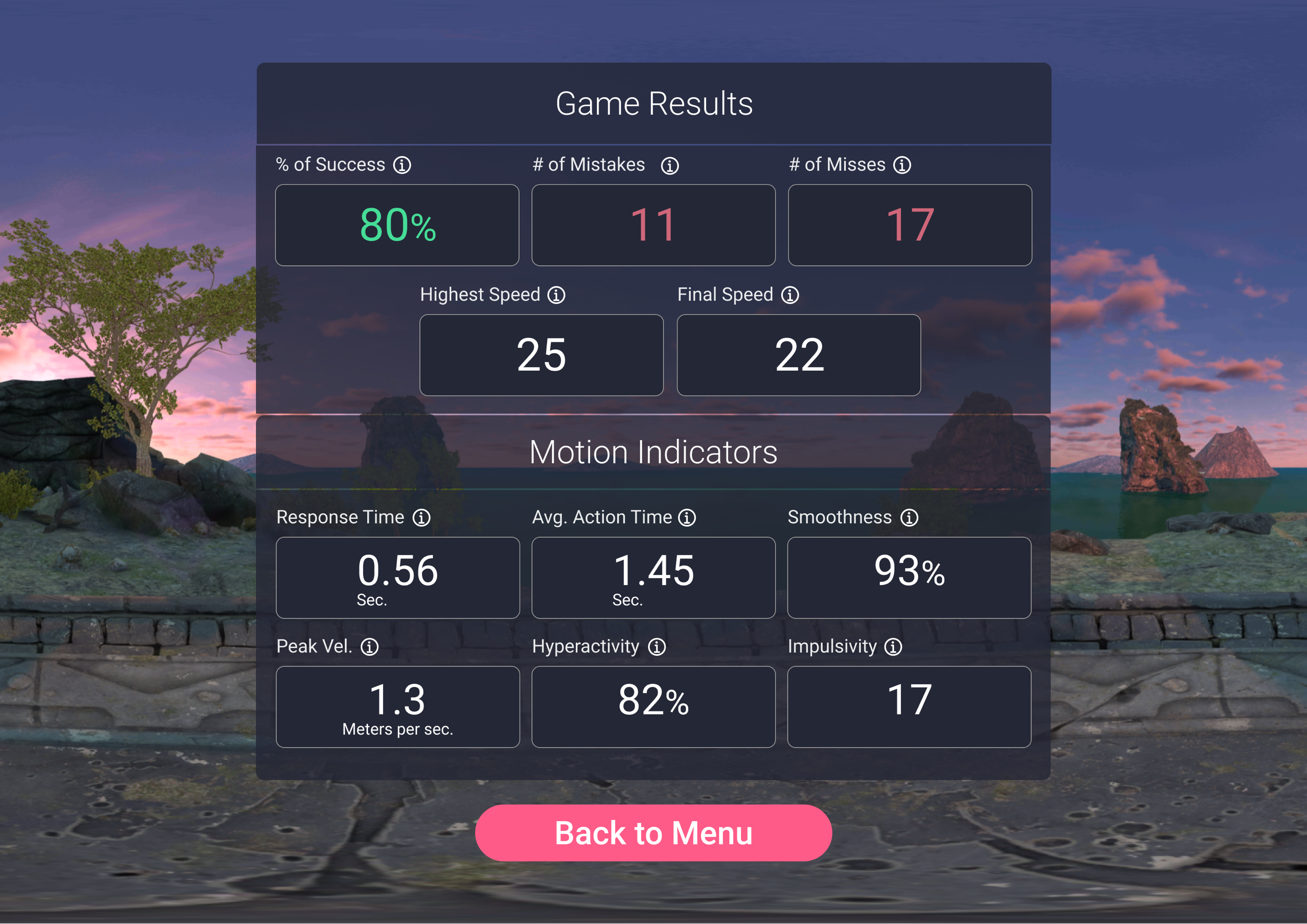
At the end of the game, a dashboard appears with a summary of the session's results.
Since we have two personas, for our patients, we chose to highlight in green where they were successful in the game and in red their mistakes/misses.
For our clinicians, we also added extended motion indicators.
I'd love to create useful and delightful products with you, let's talk.
Copyright
@2021 Dana Shaul Freud
Contact
danashaul127@gmail.com
+972 - 54 - 2523636