Training Plan
Data Portal for clinicians
Introduction
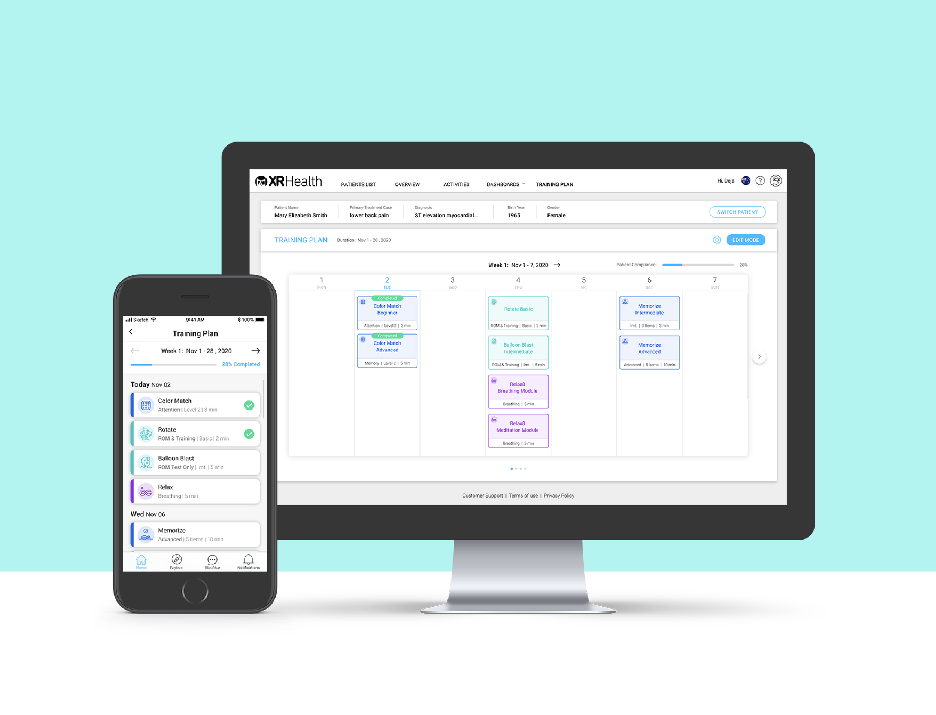
Training Plan is a multi-platform digital product that enables clinicians to design weekly personalized virtual treatments. The patients can request adjustments that are synced and monitored remotely.
My Responsibilities
- Research
- UX Design
- Usability Testing
- Visual Design
Research
Competitive Research
Before I dived into the design process, I started looking for existing similar competitors in the telehealth market.
I researched 3 leading applications (Telehab, Physiotools, Luna) and came to the following conclusions:
- Most applications provide a solution for remote treatment.
- There is a wide library of exercises that enable high customization for each patient.
- The clinicians track the patient's progress and monitor their data over time.
Key Insights
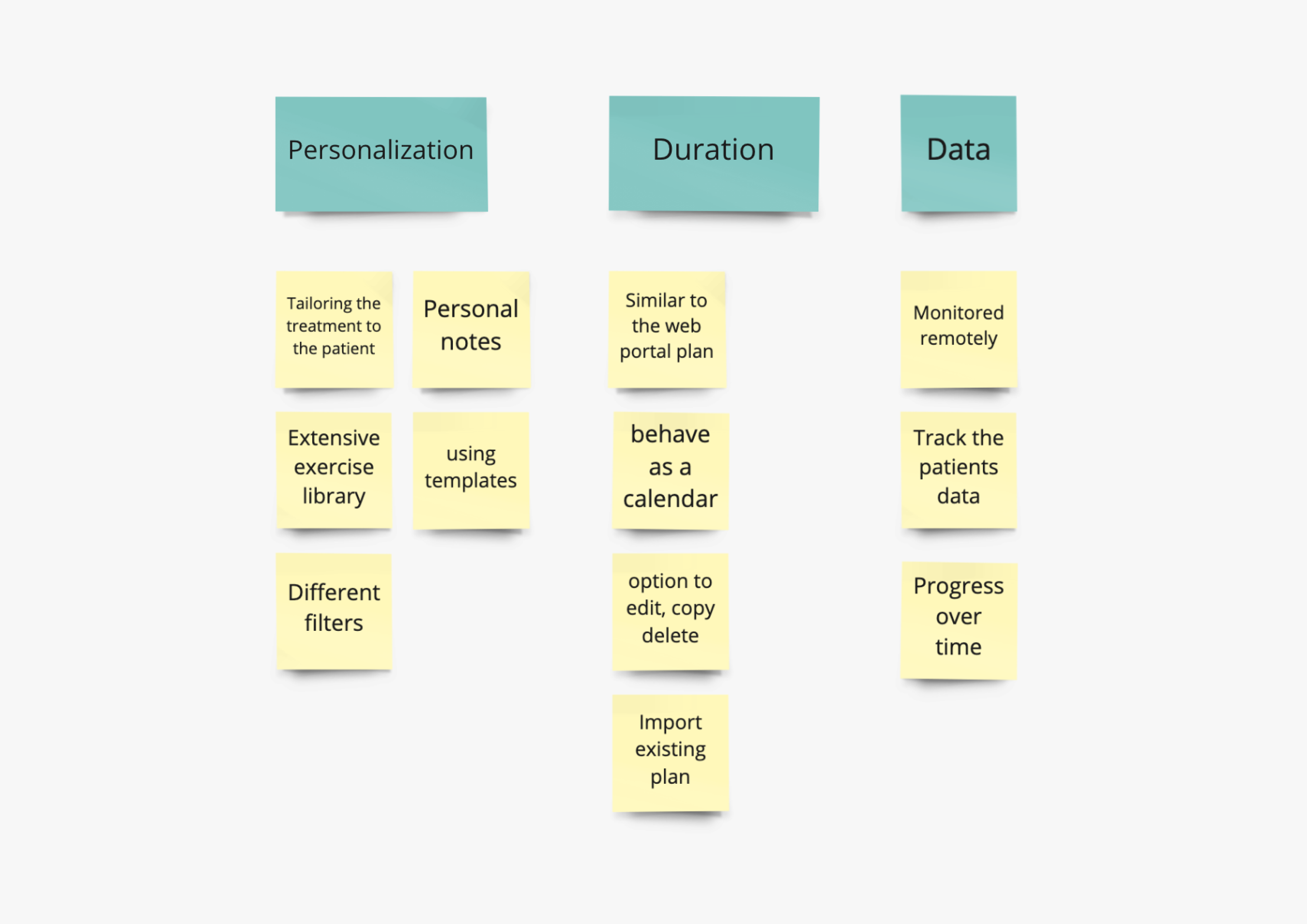
After interviewing our clinicians I focused on:
Personalization
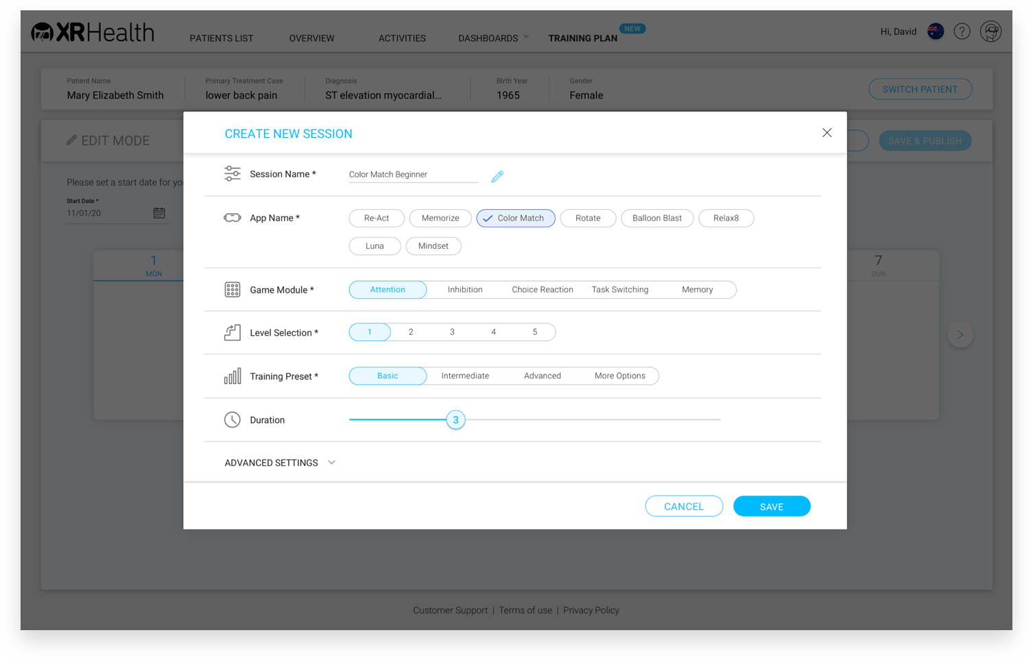
The clinicians asked for as much flexibility as possible in choosing the games, the time frame, the number of sessions, and the settings.
Scheduling Structure
I used a familiar scheduling structure, in order to save the clinicians time. I relied on the design in the data portal and the structure of a calendar.
Tracking Data
The clinicians sought to monitor the data of their patients, especially when performed remotely.
UX Design
User Flow
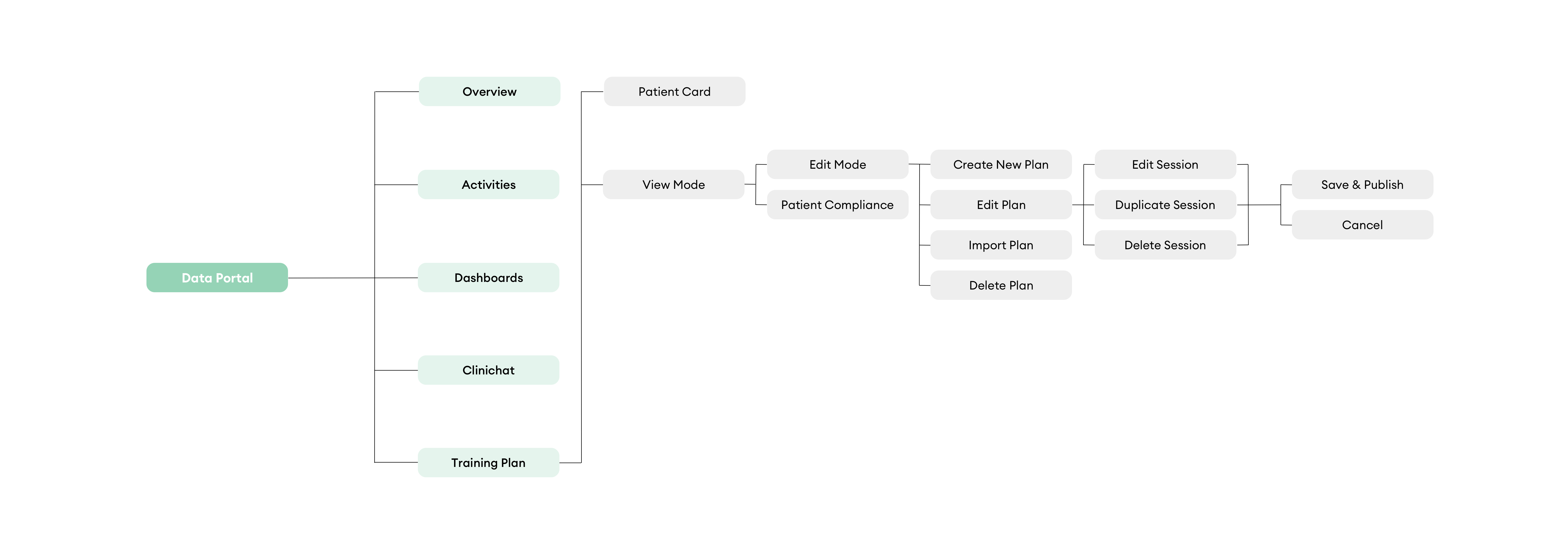
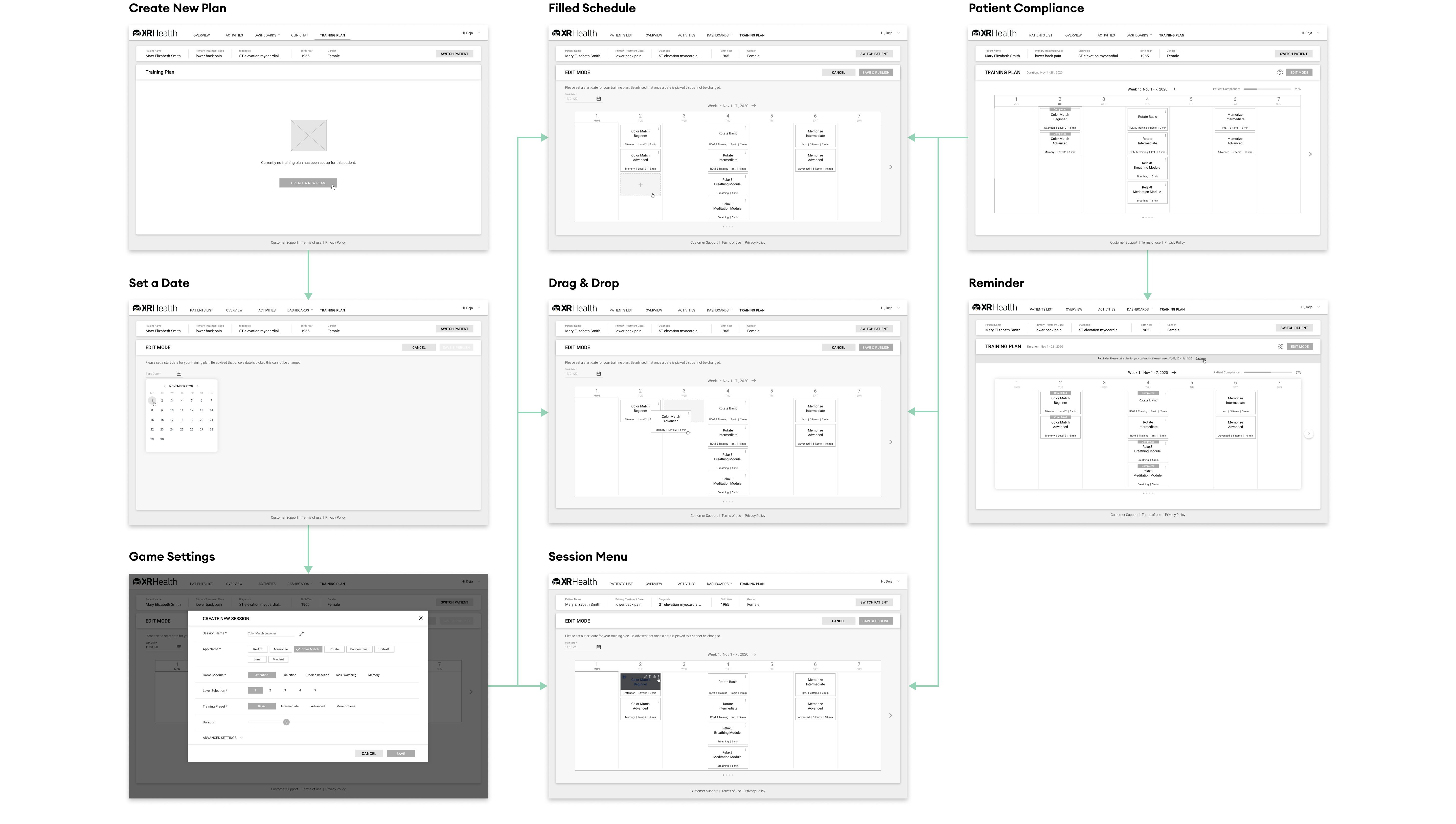
Following the insights, I decided to arrange and organize the information architecture of the training plan.
Several ideas came up regarding the user journey and plan templates. In the end, I focused on a simple, short, and self-explanatory flow.
Wireframes
Having defined the most intuitive flow, I created a number of sketches and directions for the training plan.
Since this part is done by users offline, it was important to me to produce a flow as short and usable as possible.
UX Solutions
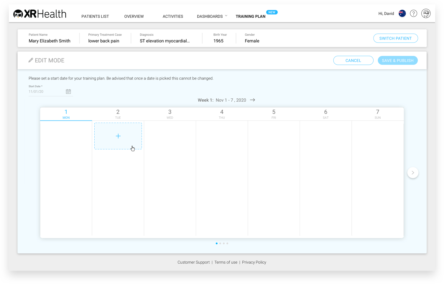
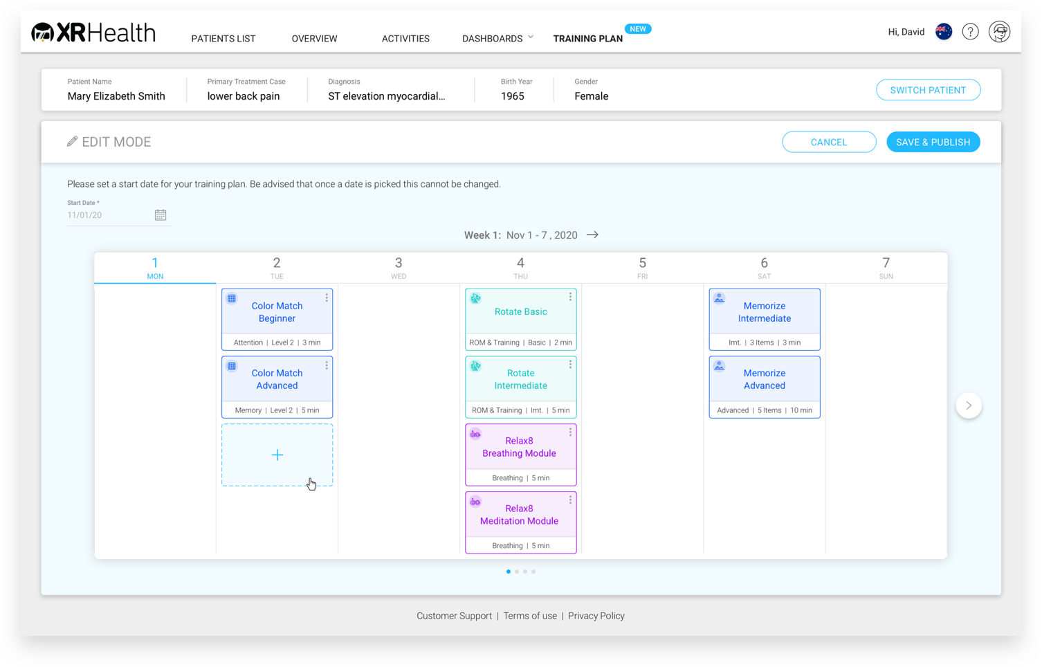
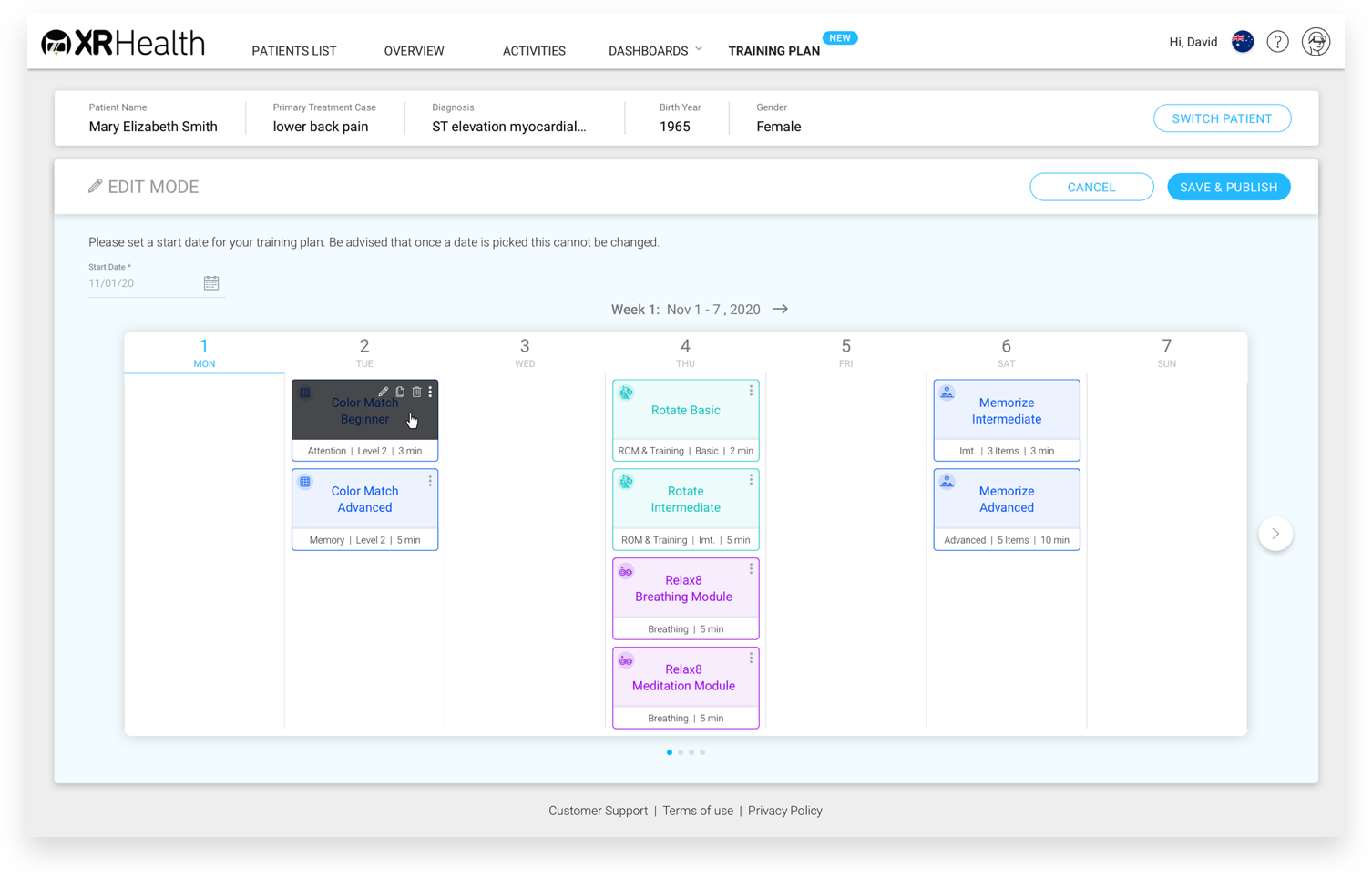
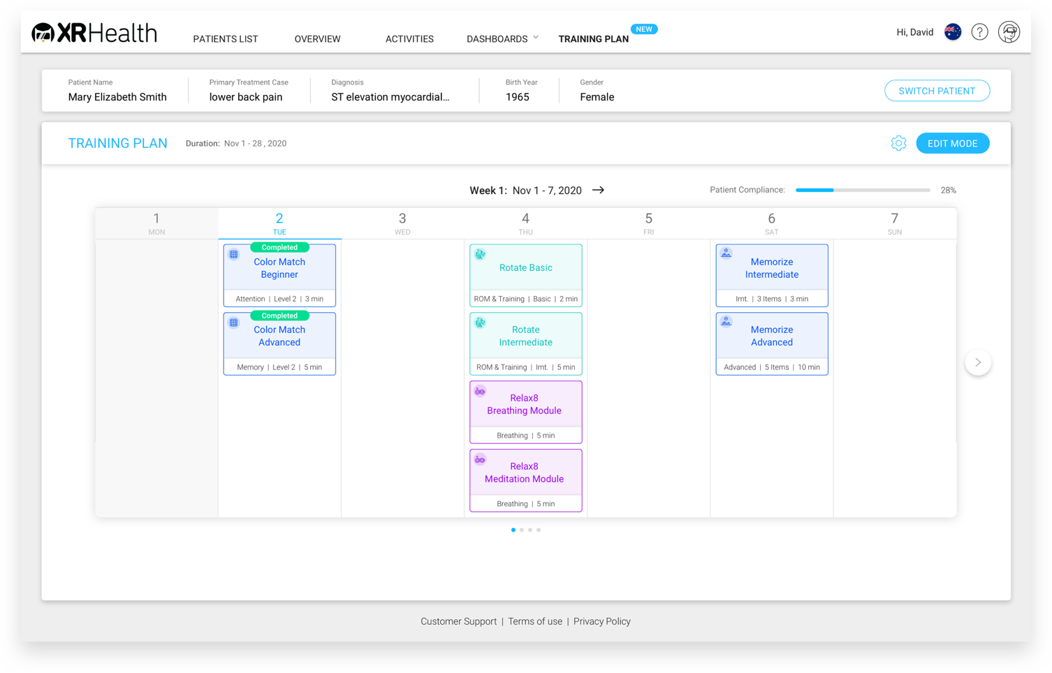
- We decided to anchor the program in a one-week format (Monday through Sunday).
- We chose to use the trivial usage paradigms of a weekly schedule (similar to a calendar).
- We left the game settings selection mechanism as it looks and behaves in the external control.
Usability Testing
Objectives
In this study, we tested the training plan feature on a mockup before releasing it to development.
Our main goals were:
- Test if our clinicians can work with the training plan easily and succeed in basic tasks.
- Check if the platform is self-explanatory and intuitive.
- Receive feedback from our clinicians about their needs.
Use Case Scenarios
- Create New Plan
- Add Session
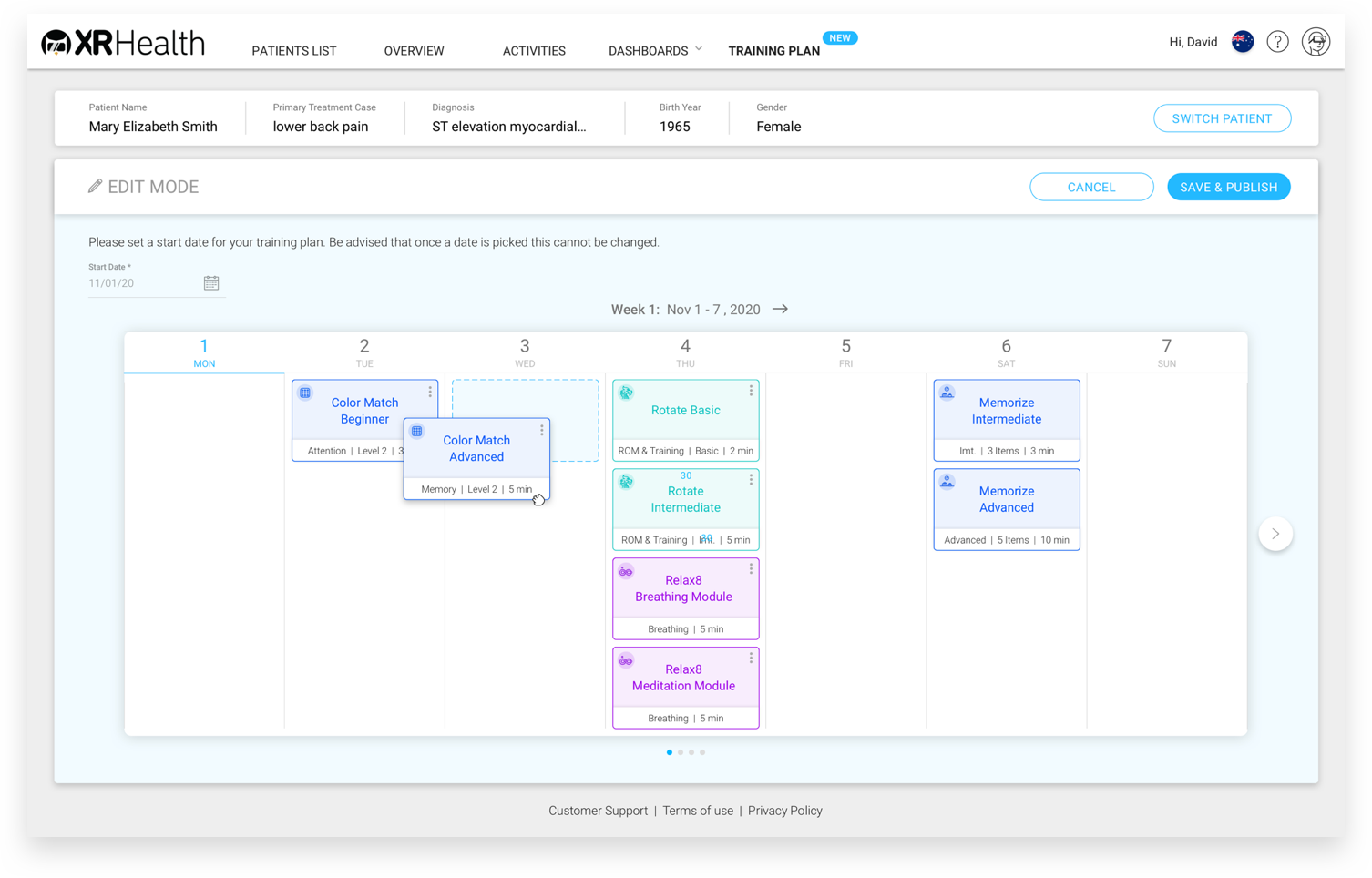
- Duplicate Session
- Save & Publish Plan

Test Results
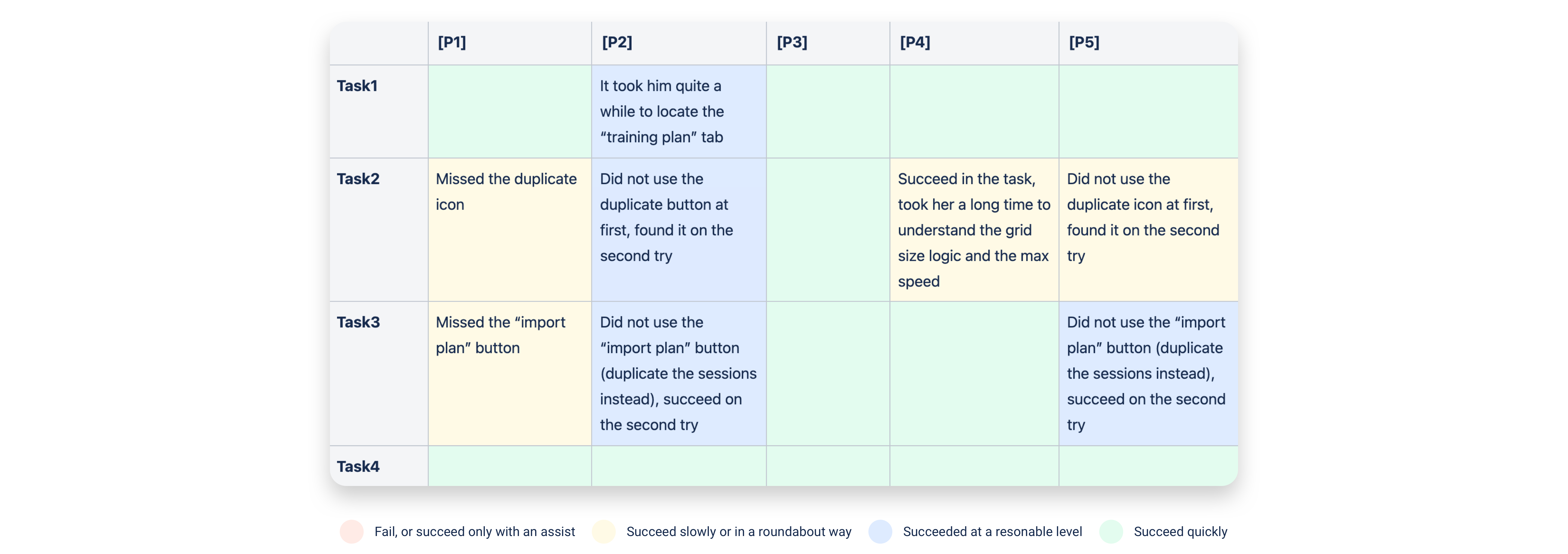
We tested 5 XRHealth clinicians (3 from Israel, 1 from Australia, and 1 from the USA).
Participants were given a short introduction and expectations from the moderator and then asked to complete four tasks.
Following that, they answered a few questions about what they experienced and their general opinion about the features. The test session was about 35 minutes long, and these were the results:
Conclusions
- Most of the participants missed the internal menu of the session card and duplicated the card in a less efficient flow.
We decided to reveal the menu by hovering on the card itself, and not by clicking on it. - Some participants stated that they preferred that during the process of duplicating, there would be the possibility to pick a date for that session, (instead of duplicating and dragging to the correct place in the table). We decided to add a date picker.
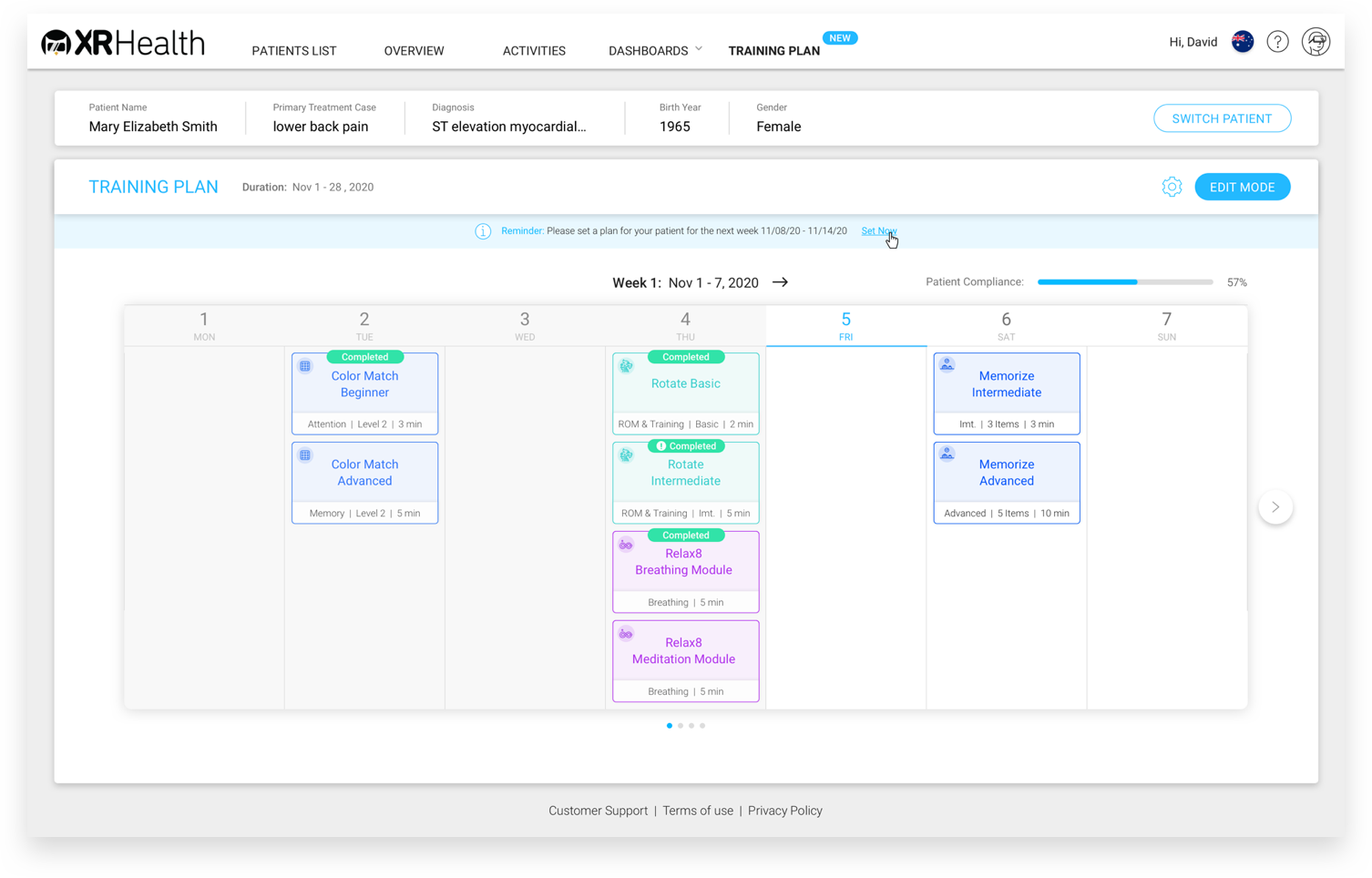
- Some of the participants missed the option to move to next week’s plan. We decided to add large arrow buttons for the next/previous week.
Visual Design
UI Guidelines
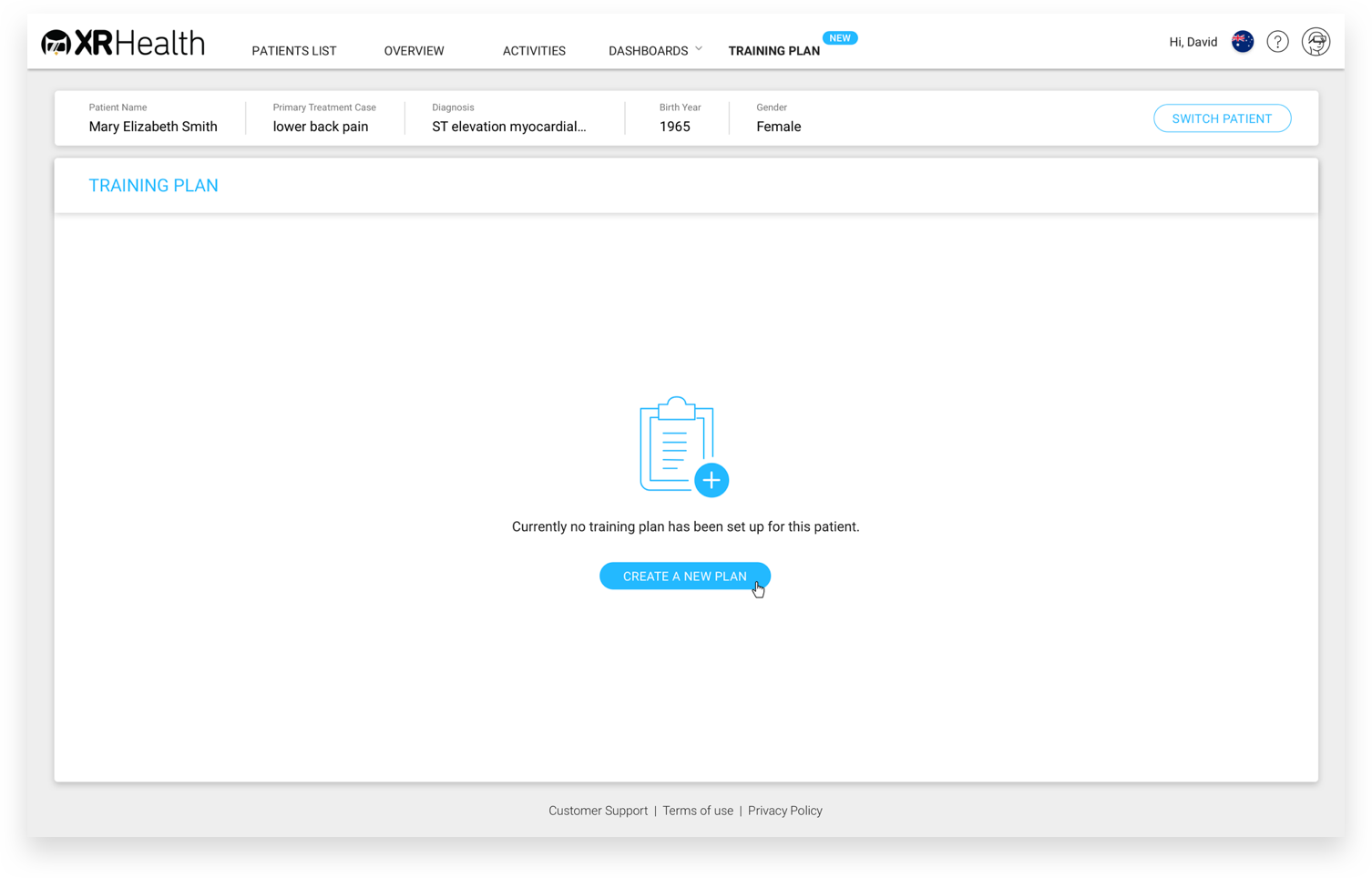
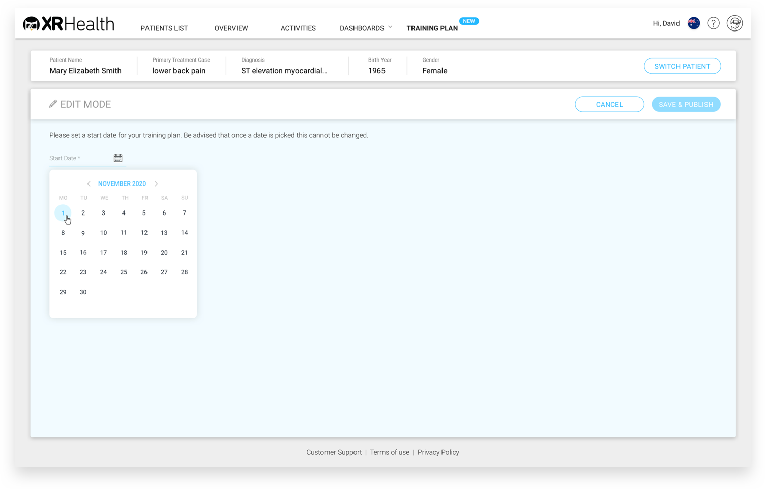
In the last part of my work on the product, I designed the interface, while following the guidelines I set:
- Visual interface and UX behavior identical to those in External Control, to shorten learning of the new feature.
- Unifying VR app colors according to 3 themes:
cognitive (blue), motor (teal), and mental (purple), similar to the color palette in the data portal.
Mobile Design
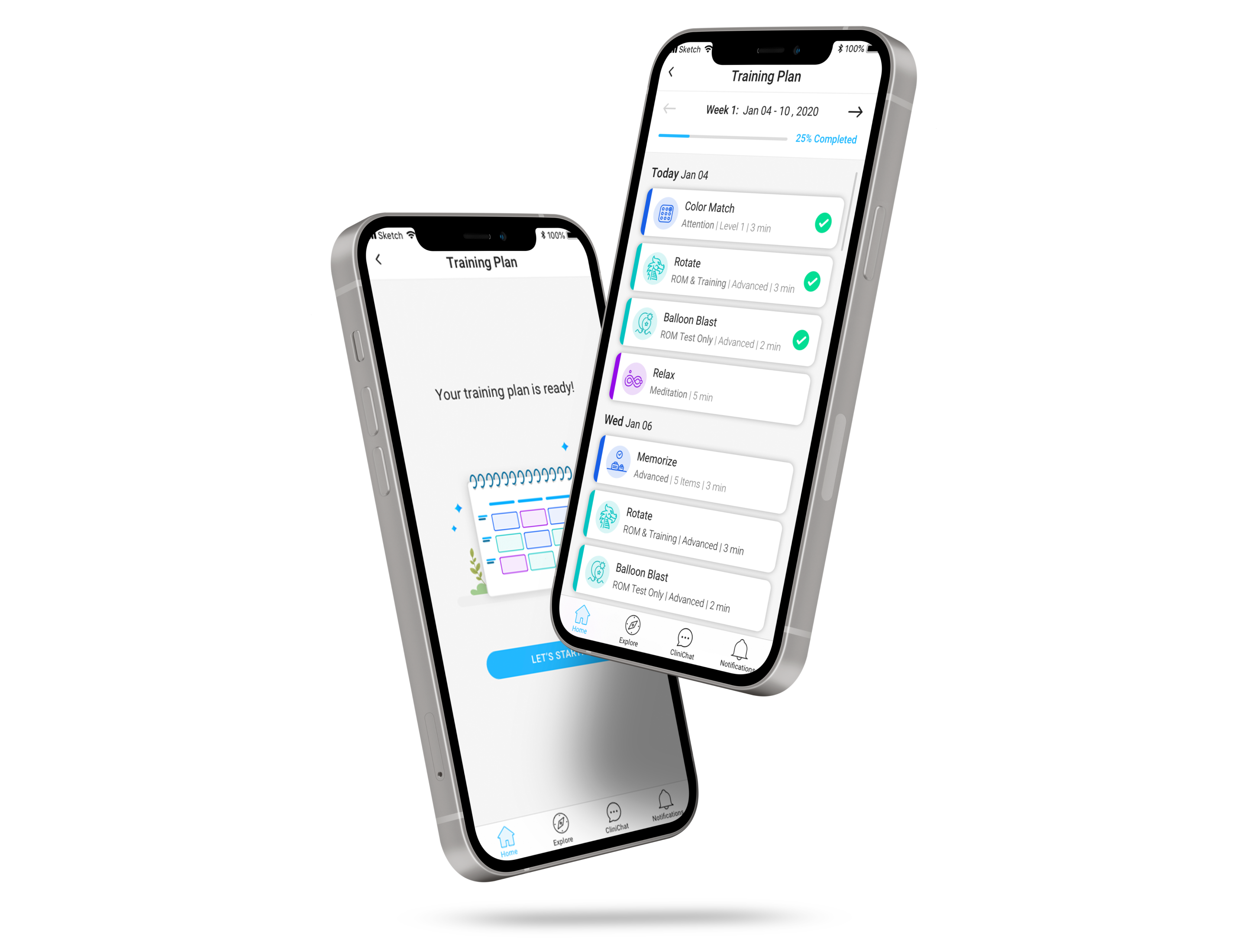
Later on, I also created a leaner version of the training plan for our mobile app.
The design here was particularly challenging as the table had to be adapted to the portrait display, in order to take into account the existing infrastructure and without compromising on the visual experience.
I chose to display specific and selected data of the upcoming sessions in clear and simple card forms.
In addition, completed sessions are represented in a green check, and those that have ended will appear in low opacity.
I'd love to create useful and delightful products with you, let's talk.
Copyright
@2021 Dana Shaul Freud
Contact
danashaul127@gmail.com
+972 - 54 - 2523636